Tap bar
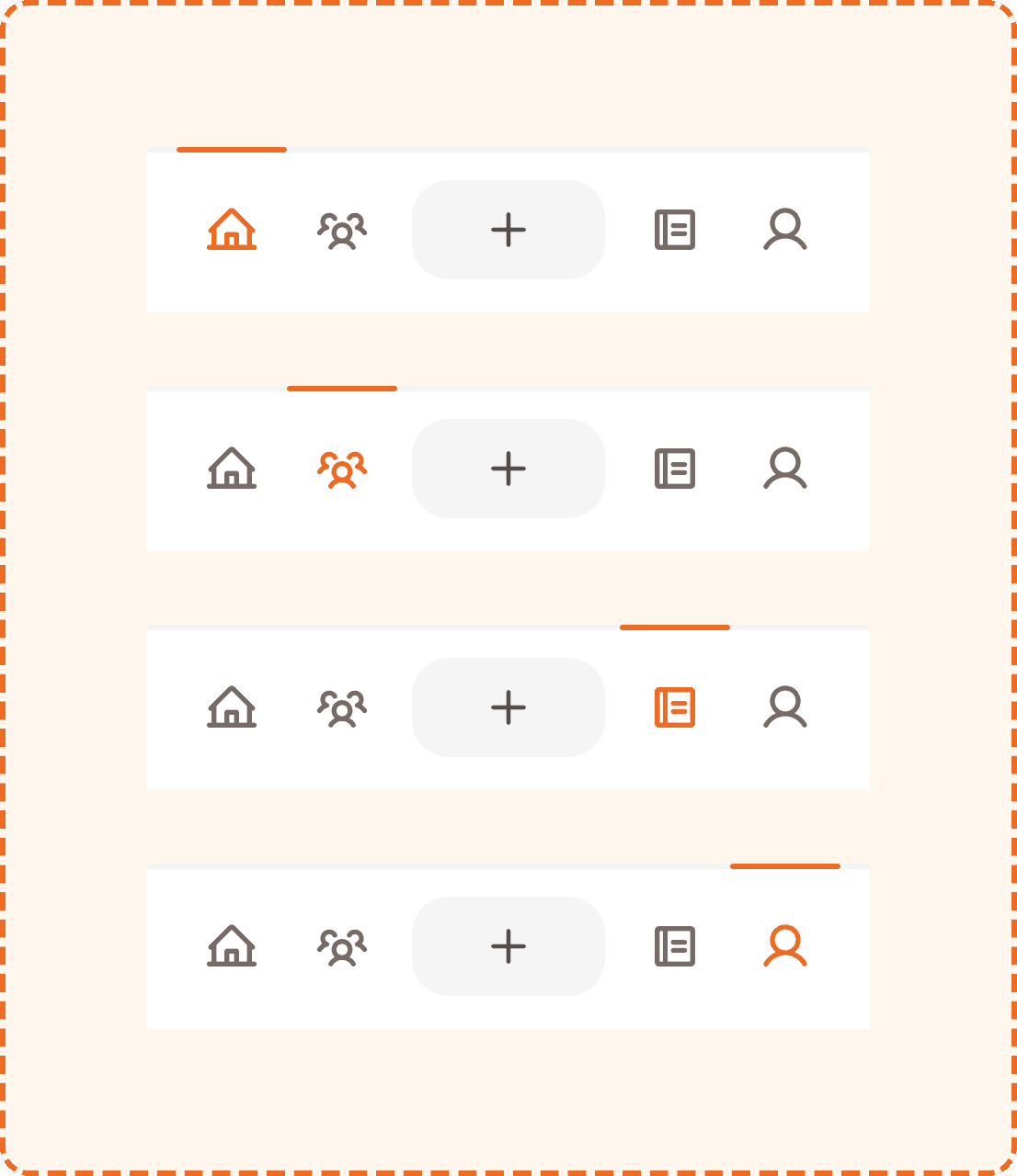
The tap bar is the primary navigation component in Muba. It sits at the bottom of every main screen and provides persistent access to the four core sections of the app, with the action button ("+" FAB) anchored in the center.
The tap bar is always visible across the main app experience, giving users constant access to navigation and content creation. Its layout is symmetrical: two navigation icons on the left, the action button in the center, and two navigation icons on the right. An orange indicator bar at the top edge marks the currently active section.
Structure
The tap bar is composed of three parts: two icon groups, a center action button, and an active tab indicator.
Container
White background (broz-bg/interactive/light/default), 3px solid top border (broz-borders/subtler), rgba(30,27,26,0.05)), 16px padding on all sides, 8px gap between items. The bar is 90px tall at minimum and spans the full width of the screen (minimum 370px).
Navigation icons (master nav)
Four icon slots arranged in two groups of two, flanking the center action button:
Left group: Home (house icon) and Social (users icon).
Right group: Workouts (notebook icon) and Profile (user icon).
Each icon uses the master nav component: a 28x28px icon inside a pill shaped container (60x52px) with full border radius (9999px). The container uses 16px horizontal and 12px vertical padding.
Action button
The action button ("+" icon) sits in the center of the bar. It uses flex-1
to fill the available space between the two icon groups. It has a gray background (broz-bg/neutral/middle/default, #f6f5f5), 54px height, 20px border radius, and a 24x24px plus icon.
Tab indicator
An orange bar (broz-icons/interactive/tiertary, #ed6a22) that sits at the very top edge of the tap bar, above the border. It is 3px tall, 60px wide, with fully rounded ends (9999px radius). It visually marks which section is currently active by positioning itself above the corresponding icon.
Tabs
The tap bar supports four navigation tabs via the tab prop:
Home
The default landing screen. Shows the house icon. When active, the icon turns orange and the indicator bar sits above it.
Social
The friends and community section. Shows the users/group icon. When active, the icon turns orange and the indicator bar moves above it.
Workouts
The workout library and history section. Shows the notebook icon.
Profile
The user's profile and settings. Shows the user icon.
Interaction
Tapping a navigation icon switches the active tab immediately. The tab indicator bar animates smoothly to the new position. The screen content transitions to the selected section.
Tapping the center action button opens the action popover menu (see Action Button component). It does not navigate to a new section.
Tapping the already active tab may scroll the content to the top or refresh it, depending on the section.
The tap bar does not hide on scroll. It remains fixed at the bottom of the viewport at all times on main screens.
Placement
The tap bar is pinned to the absolute bottom of the screen, below all content. It sits above the device safe area on phones with gesture navigation (iPhone home indicator, Android nav bar).
The tap bar should be the lowest element in the visual hierarchy. Nothing floats below it except the device system UI.
When a footer action bar (see Footer Actions component) is present on the same screen, the footer actions sit above the tap bar, and the tap bar remains visible below them.
Accessibility
Touch target. Each navigation icon has a tappable area of 60x52px, exceeding the 44px minimum. The action button is 97x54px. Combined with the 16px padding around the bar, accidental taps on the wrong icon are minimized.
Screen reader. Each tab should be announced with its section name and selection state: "Home, selected, tab, 1 of 4", "Social, tab, 2 of 4." The action button should announce "Create new, button."
Keyboard. Left/Right arrow keys move between tabs. Enter or Space activates the selected tab. The action button is reachable via Tab key.
Focus indicator. The focused tab displays a visible focus ring around the pill shape.
Color independence. The active tab is communicated through three simultaneous signals: the icon turns orange, the pill background becomes tinted, and the indicator bar appears above it. The inactive state uses a completely different visual treatment (dark gray icon, no background, no indicator). These differences are perceivable even in grayscale.
Content
The tap bar uses icons only, with no text labels. This works because the app has only four sections, and the icons are common and recognizable:
House for Home
Group/users for Social
Notebook for Workouts
Person silhouette for Profile
Plus sign for Create (action button)
If future iterations add more sections or if user testing reveals confusion, consider adding short text labels below each icon (e.g., "Home", "Social"). For now, the icon only approach keeps the bar compact and clean.
Best practices
Keep the tap bar to a maximum of 5 items (4 navigation + 1 action). Adding more items would shrink touch targets below comfortable sizes.
The center position for the action button is deliberate. It is the most prominent position and the easiest to reach with either thumb while holding the phone one handed.
The tab indicator bar should animate between positions with a smooth horizontal slide (approximately 200ms ease). Jumping instantly feels broken.
Hide the tap bar during focused flows like an active workout session, onboarding, or authentication. Showing it during these flows creates escape routes that distract from the task.
The 3px top border is very subtle (5% opacity). This is intentional. The tap bar should feel like a natural extension of the screen, not a heavy bar sitting on top of the content.
