Action button
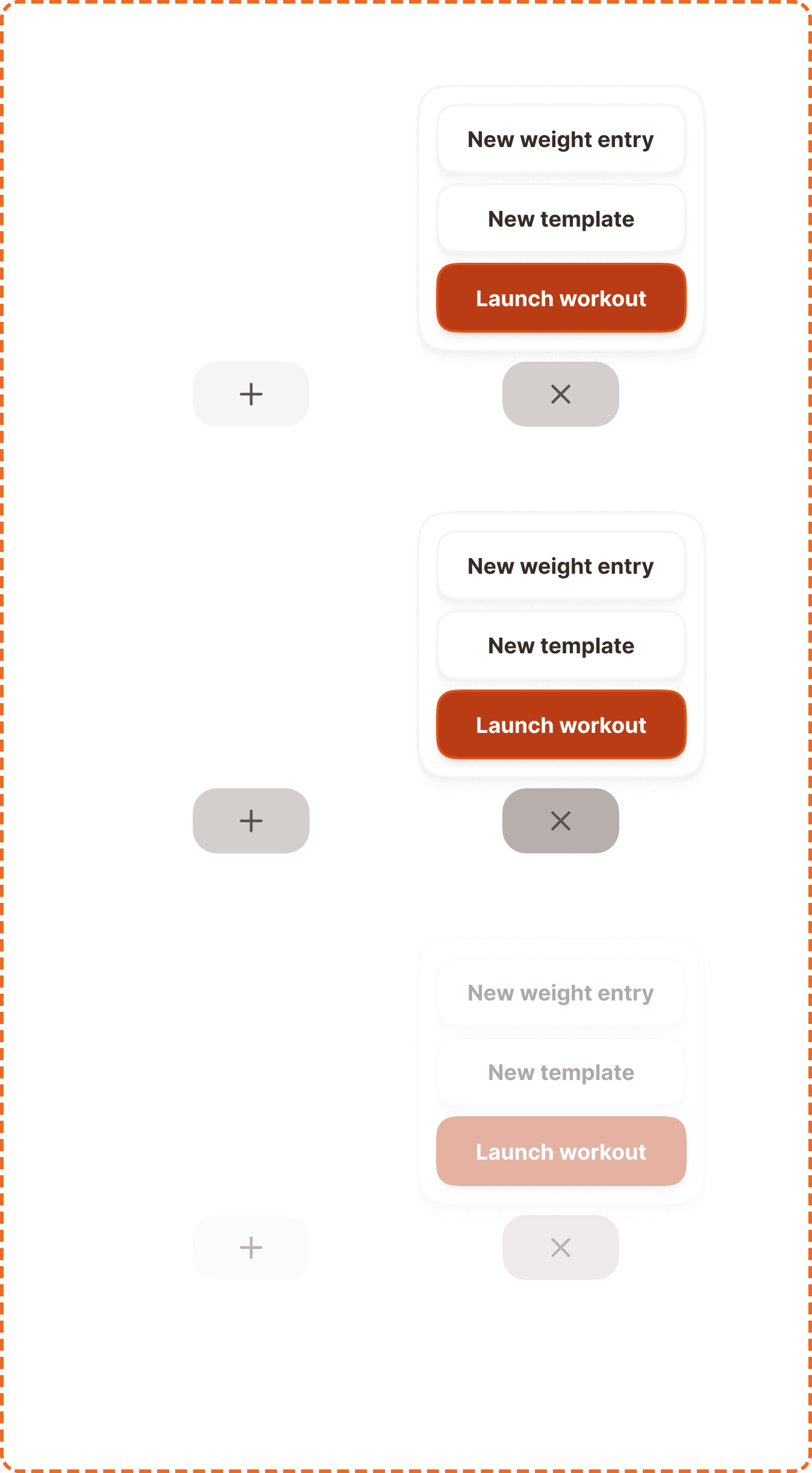
An action button is a floating pill-shaped trigger that opens a contextual menu of quick actions. It uses a "+" icon when closed and switches to an "x" icon when the menu is open, giving users a clear visual cue of the toggle state. The menu that appears is called the action popover.
In Muba, the action button is the primary entry point for creating new content starting a workout, creating a new template, or logging a weight entry. It floats above the interface and is always accessible, making it the fastest way to initiate the app's core actions.
When to use
Use an action button:
Inside the Tap bar component.
Don't use an action button:
Anywhere else than the Tap bar component.
Modes
The action button has two modes that define whether the popover menu is visible.
Inactive (closed)
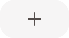
The default mode. The button displays a "+" icon, signaling that tapping it will reveal available actions. The popover is hidden.
Active (opened)
The popover menu is visible. The button switches to an "x" icon, signaling that tapping it will close the menu. The transition between "+" and "x" should feel smooth and intentional.
Interaction
Each mode supports 3 states
Default is the resting state. The button sits at full opacity with the appropriate icon ("+" or "x"), ready for interaction.
Pressed gives immediate feedback during a tap. The button darkens to confirm the touch was registered.
Disabled reduces the button to low opacity with no pointer events. This is rare but may occur when a prerequisite action must be completed first (e.g., the user must finish onboarding before creating content).
Action popover
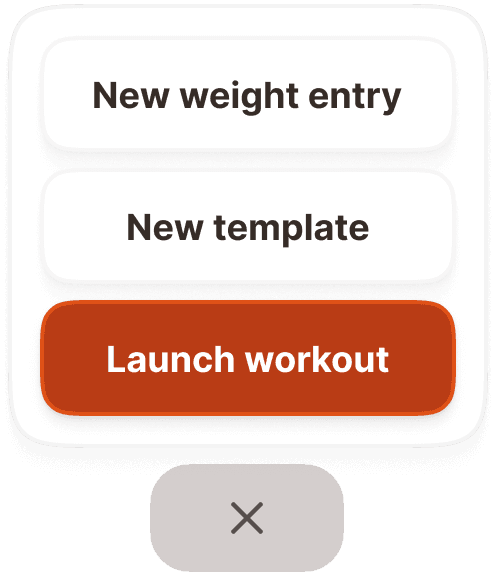
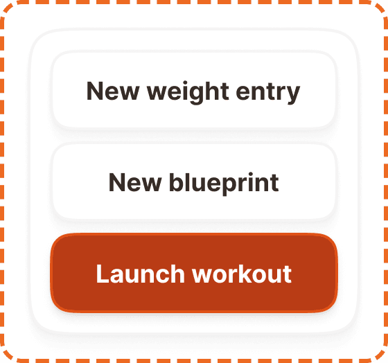
The action popover is the menu that appears when the action button is in active mode. It is a floating card containing a vertical stack of action items, with the most important action emphasized at the bottom.
Structure
The popover contains 2-4 action items stacked vertically inside a rounded card with a subtle shadow. The items follow a clear hierarchy:
Secondary actions sit at the top. These use a secondary/outlined button style. Examples: "New weight entry", "New blueprint".
Primary action sits at the bottom. This uses the primary filled button style to anchor the menu with the most important action. Example: "Launch workout".
This ordering ensures the primary action is closest to the user's thumb, since the popover appears above the action button which sits at the bottom of the screen.
Accessibility
Touch target. The action button is a 97x54px pill, which exceeds the 44px minimum touch target. No invisible padding needed. Pop-over action items also meet minimum touch target sizes as they use standard button components.
Color independence. The "+" and "x" icons communicate the mode through shape, not color. The primary action inside the popover uses both a filled background and position (bottom) to distinguish it from secondary items.
Content
The action button itself has no text label. It relies entirely on the "+" and "x" icons. This works because the "+" icon is universally understood as "create" or "add", and the "x" icon is universally understood as "close" or "dismiss."
Pop-over action labels should:
Start with a verb or "New" to signal creation: "Launch workout", "New template", "New weight entry".
Be 2-3 words maximum. These are quick-action labels, not sentences.
Be specific enough that the user knows exactly what will happen before tapping.
Avoid generic labels like "Create" or "Add" without a noun.
"Launch workout" is good. Clear action, specific outcome.
"New weight entry" is good. Tells the user exactly what they are creating.
"New blueprint" is good. Short, specific, starts with "New".
"Create" is bad. Create what? Too vague for a quick-action menu.
Best practices
The action button should only appear in the Tap bar component.
Animate the "+" to "x" rotation smoothly. An abrupt swap feels broken. A 200-300ms rotation feels intentional.
