Help button
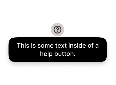
A help button provides contextual assistance by displaying a tooltip when tapped or clicked. It uses a small "?" icon that triggers a dark popover containing a short explanation, helping users understand a feature, term, or field without leaving the current screen.
In Muba, help buttons appear next to unfamiliar concepts and domain-specific terms like RPE, 1RM, volume, or deload. They are especially important for beginner users who need guidance without the interface being overwhelming for experienced lifters. The tooltip delivers the explanation in place, without navigation.
When to use
Use a help button:
When a label, metric, or setting uses domain-specific terminology that some users may not understand (e.g., "RPE", "1RM estimated", "progressive overload").
When a field or toggle needs a brief explanation of what it does or why it matters.
When you want to provide optional context without cluttering the interface with permanent helper text.
Don't use a help button:
When the information is critical to completing the task. Show it inline instead of hiding it behind a tap.
When the label itself can be made clearer. Rewrite the label before resorting to a help button.
When the explanation is longer than 2-3 sentences. Link to a help page or article instead.
When every field on the screen would need one. If most fields need explanation, the screen design needs rethinking.
Types
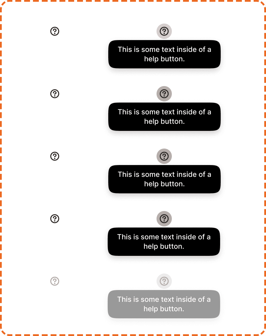
The help button has two modes that define whether the tooltip is visible.
Inactive
The default mode. The "?" icon is visible but the tooltip is hidden. The user has not interacted with the button yet, or has dismissed the tooltip.

Active
The tooltip is open. A dark popover appears near the icon displaying the explanation text. The popover stays visible until the user taps outside of it or taps the button again to dismiss.
Interaction
The help button supports 5 states, each applying to both inactive and active modes.
Default is the resting state. The "?" icon sits at normal opacity, ready for interaction.
Hovered provides a subtle visual shift when the cursor is over the icon on desktop.
Pressed gives immediate feedback during a tap or click. The icon darkens or scales slightly.
Focused displays a visible focus ring for keyboard and assistive technology navigation.
Disabled reduces the icon to low opacity with no pointer events. Use this when the help content is temporarily unavailable or the related feature is disabled.
Placement
Position the help button directly next to the label, metric, or setting it explains. It should feel like a natural extension of the text, not a separate element floating nearby.
Place the help button to the right of the label it explains.
Don't place help buttons far from their related content. The connection must be visually obvious.
Tooltip placement
The tooltip popover appears above the icon by default. If there is not enough space above (e.g., near the top of the screen), it repositions below the icon automatically.
Accessibility
Touch target. The visual icon is 26x26px, which is below the 44px minimum for touch targets. To solve this, the component uses invisible padding around the icon that expands the tappable area to at least 44x44px without changing the visual size. This keeps the icon compact while meeting accessibility requirements.
Keyboard. Enter or Space to toggle the tooltip open/closed. Escape to dismiss.
Screen reader. Add an aria-label to the button hinting at the tooltip content (e.g., "What is RPE?"). When the tooltip opens, its content should be linked via aria-describedby so screen readers announce the explanation automatically.
Focus indicator. A visible focus ring appears around the icon area (not just the 26px visual, but the full interactive area).
Color independence. The "?" icon communicates its purpose through shape, not color. The tooltip uses a high-contrast dark background with white text to ensure readability in all lighting conditions, including bright gym environments.
Content
Tooltip copy should:
Answer one specific question: "What is this?" or "Why does this matter?"
Be 1-3 sentences maximum. If you need more, link to a help article.
Use plain language. Avoid jargon even when explaining jargon.
Start with a definition or explanation, not a question.
"RPE stands for Rate of Perceived Exertion. It measures how hard a set felt on a scale of 1-10." is good. Short, clear, directly useful.
"Click here to learn more about RPE and how it relates to your training intensity and recovery needs over time." is bad. Too long, too vague, and uses "click here."
"1RM is your estimated one-rep max for this exercise, calculated from your recent sets." is good. Defines the term and explains the source.
Best practices
Use help buttons sparingly. If a screen needs more than 2-3, simplify the interface first.
Never put critical information only inside a tooltip. If the user must know something to complete their task, show it inline.
Keep tooltip text short. The dark popover is not designed for paragraphs.
Test your tooltip placement on small screens. Ensure the popover does not overflow the viewport.
