Chart
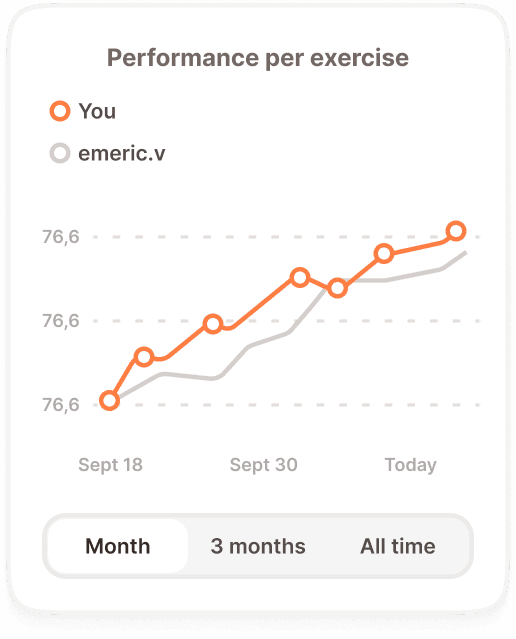
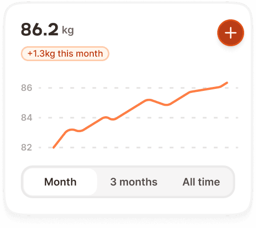
A chart visualizes performance data over time as a line graph inside a card container. It shows the user's progression for a specific exercise or metric, with optional comparison against another user. Each data point is tappable, revealing a tooltip with the session details.
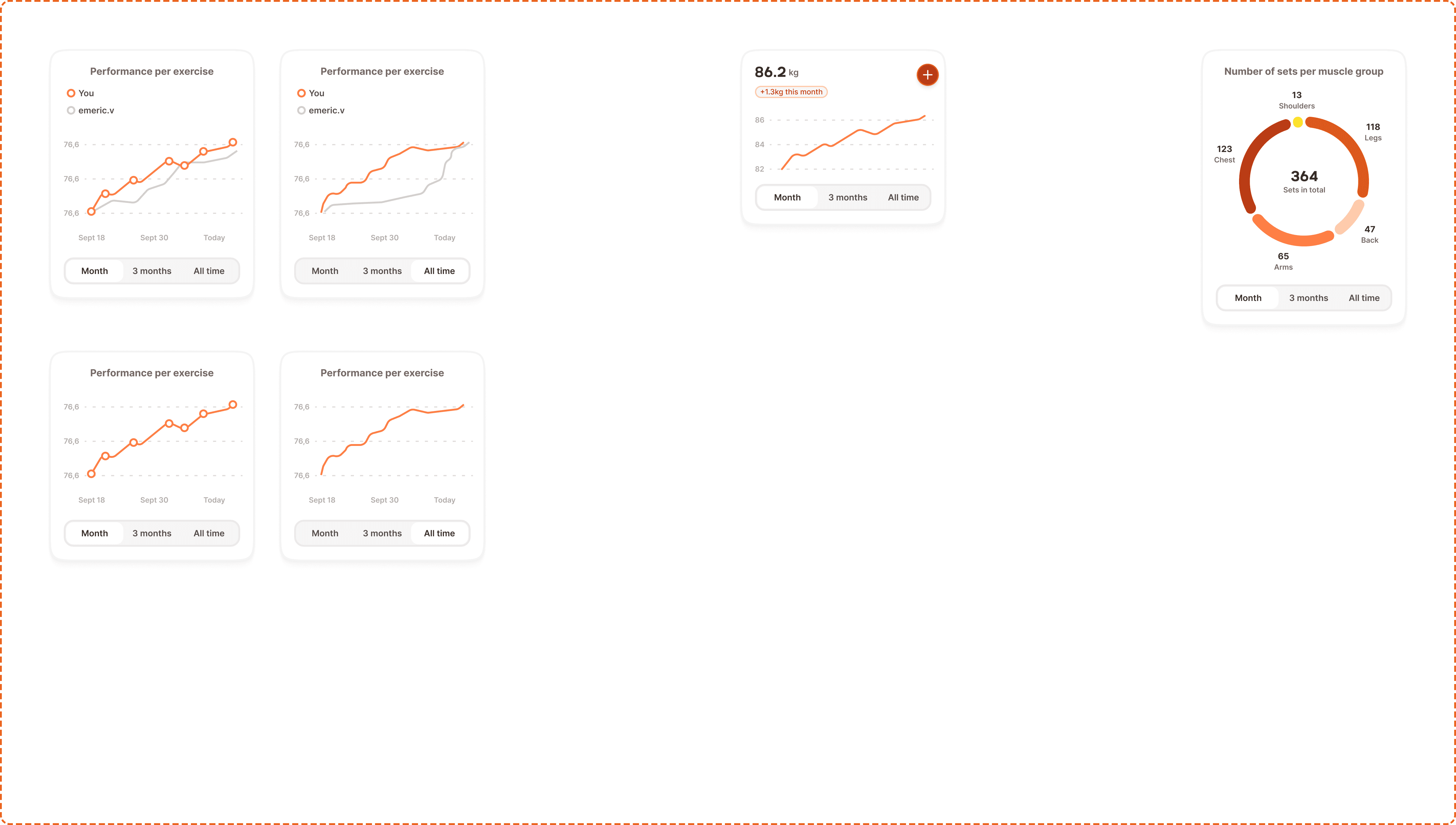
In Muba, charts are the primary way users review their training progress after a workout. They answer the question "Am I getting stronger?" by plotting weight, reps, or performance scores across sessions. The comparison mode lets users see how they stack up against a friend, adding a social motivation layer on top of the data.
Structure
The chart component is a card containing several stacked layers:
Chart card container
A white card with rounded corners and a subtle border, matching the standard card styling used elsewhere in the system. Contains all chart elements with internal padding.
Header
A title ("Performance over time") with a small icon/indicator to the left. When comparison mode is on, a legend sits below the title showing colored dots with user names: orange dot + "You", gray dot + "[username]".
Graph area
The main visualization area containing:
Y axis on the left side showing numeric values (e.g., 76,6). Values use a horizontal dashed gridline to aid readability.
X axis at the bottom showing date labels (e.g., "Sept 18", "Sept 30", "Today").
Data lines rendered as connected curves. Orange for the user's data, gray for the comparison user. In month view with comparison on, dots are visible on each data point. In all time view, lines are smoother with less granular point markers.
Time range control
A segmented control at the bottom of the card with two options: "Month" and "All time". The active segment uses bold text. Tapping switches the chart between the two time ranges.
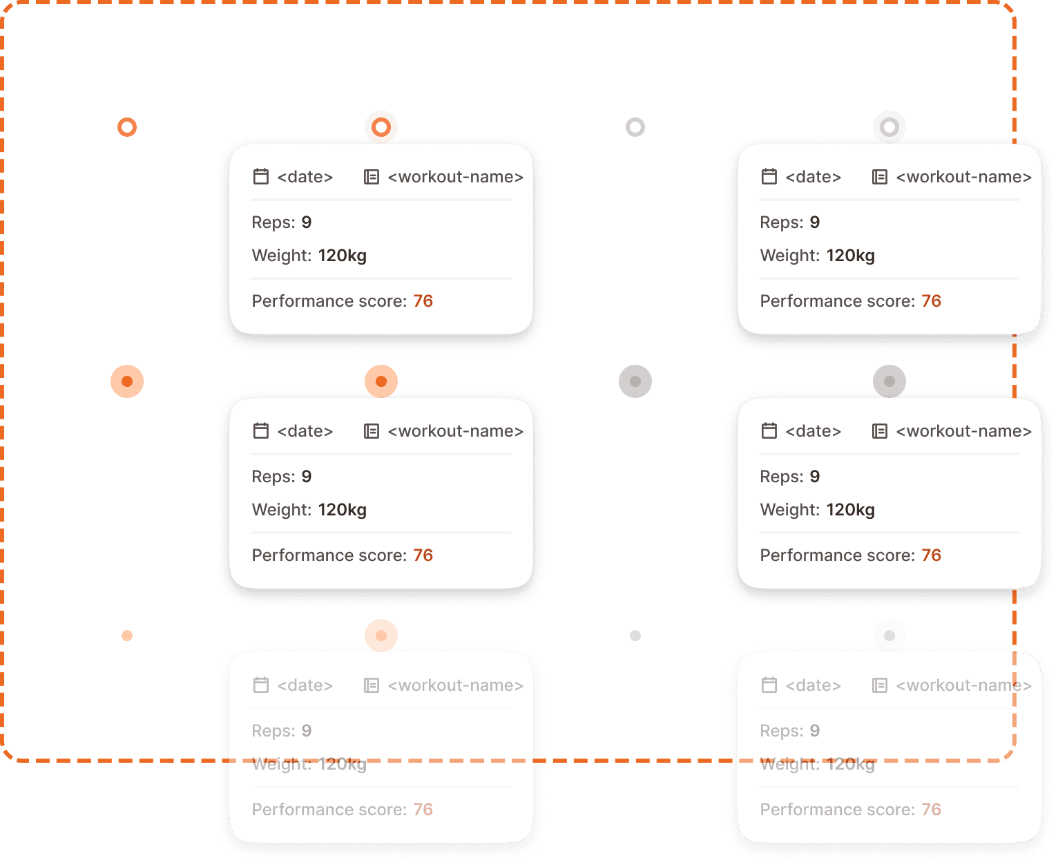
Tooltip dot
Each data point on the chart line is an instance of the dot+padding component. It is a 24x24px interactive element (including invisible padding for touch accessibility).
Properties
branded? controls the dot color. Yes uses the brand orange for the user's own data. No uses gray for comparison users.
active? controls whether the tooltip (dot-menu) is visible. Yes shows the tooltip anchored to the dot. No shows the dot without a tooltip.
state controls interaction feedback:
Default is the resting state. The dot is visible at normal size.
Pressed gives immediate feedback during a tap. The dot may scale up slightly.
Disabled reduces the dot to low opacity. Used when the data point exists but cannot be interacted with (e.g., comparison user's points when only the user's data is tappable).
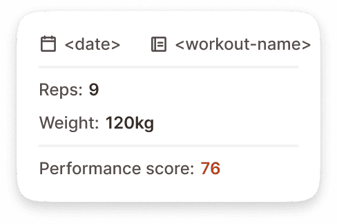
Tooltip
The dot-menu is the floating tooltip that appears when a data point is tapped. It is a small card anchored to the active dot, showing the session details for that specific data point.
Content
The tooltip displays:
Date and workout name at the top, with calendar and workout icons preceding each value.
Reps showing the rep count for that session (e.g., "Reps: 9").
Weight showing the weight used (e.g., "Weight: 120kg").
Performance score at the bottom, with the numeric value highlighted in the brand orange color (e.g., "Performance score: 76").
Behavior
Tapping a data point opens the tooltip anchored to that dot. Tapping another data point closes the current tooltip and opens a new one. Tapping outside any data point closes the tooltip. Only one tooltip can be open at a time.
Variants
Line chart
Weight chart
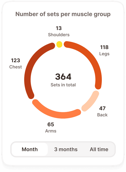
Muscle balance chart
Interaction
The chart card itself is not scrollable or zoomable on mobile. The data is rendered to fit within the card width.
Tapping a data point (dot) activates it and shows the tooltip with session details. The dot transitions to its active state and the tooltip appears with a subtle fade in.
The time range segmented control at the bottom switches between month and all time views. Tapping a segment updates the chart data and re renders the lines. The transition should feel instant.
In comparison mode, only the user's own data points (orange) are tappable. The comparison user's data points (gray) are visible but not interactive (disabled state).
Best practices
Show a minimum of 3 data points before rendering a chart. With fewer than 3 points, a line chart is misleading. Show an encouraging empty state instead ("Keep training! Your progress chart will appear after 3 sessions.").
The comparison mode is opt in. Never show a comparison by default. The user should explicitly choose to compare against a friend.
When the user switches between month and all time, preserve the tooltip state. If a tooltip was open, close it during the transition and let the user tap again on the new view.
The performance score in the tooltip uses orange text to draw attention to the most important metric. This is one of the few places where colored inline text is used outside of badges and banners.
On all time view with many data points, consider downsampling the visible dots to prevent visual clutter. Show every Nth point while keeping the line continuous.
