Modal
A modal is a dialog overlay that interrupts the user's flow to request a decision or confirmation before proceeding. It appears centered on the screen with a dimmed backdrop, blocking interaction with the content behind it until the user responds.
In Muba, modals are used for high consequence confirmations that require the user's deliberate attention: deleting a program, discarding unsaved changes, or confirming an irreversible action. They are intentionally disruptive because the consequences of proceeding without thinking are significant. Modals should be rare and meaningful. If they appear too often, users stop reading them.
When to use
Use a modal:
When the user is about to perform a destructive action that cannot be undone (deleting a program, removing a template, clearing workout history).
When the user is about to lose unsaved work (navigating away from an edited template, closing an active workout without saving).
When a confirmation is legally or functionally required before proceeding.
Don't use a modal:
For informational messages that do not require a decision. Use an info banner instead.
For transient feedback like "Workout saved." Use a toast or success banner instead.
For settings or preferences. Use inline controls (toggles, checkboxes) instead.
For content that the user needs to reference while making a decision. Modals block the content behind them, so the user cannot compare or review.
Frequently. If every other action triggers a modal, users develop "confirmation fatigue" and start tapping through without reading.
Types
The modal has 2 types controlled by the type property.
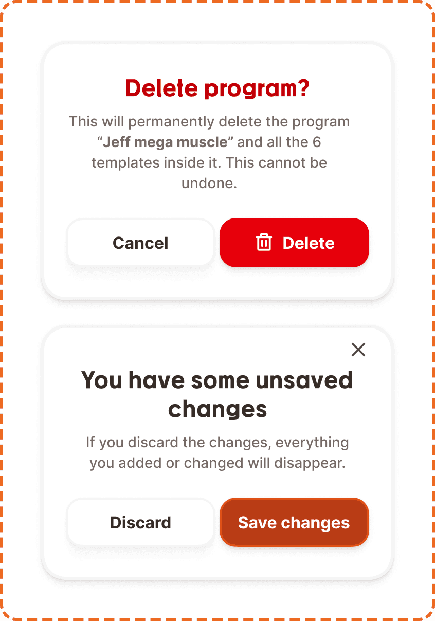
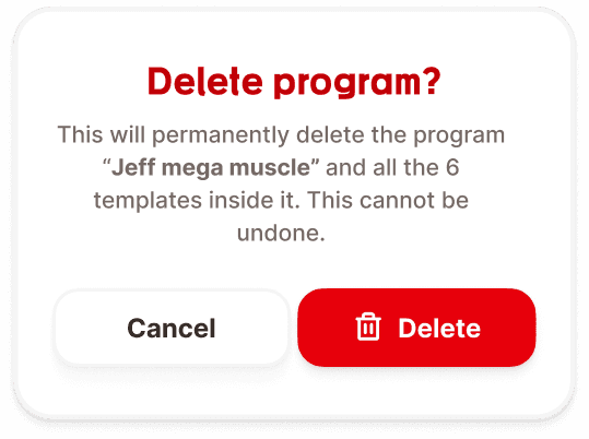
Delete
Used for confirming destructive, irreversible actions. The heading uses the danger color (red, broz-content/danger/secondary, #c10007) and the Mubax heading font to signal severity. The body text explains exactly what will be deleted and that it cannot be undone, with the entity name displayed in bold. The action buttons are "Cancel" (secondary) and "Delete" (destructive red with a trash icon).
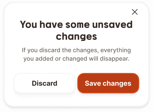
Discard
Used for confirming the loss of unsaved changes. The heading uses the neutral primary color (dark, broz-content/neutral/primary) in the Mubax heading font. A close (x) button appears in the top right corner. The body text explains what will happen if the user discards. The action buttons are "Discard" (secondary) and "Save changes" (primary brand orange).
Structure
The modal is a fixed width card (343px) containing stacked elements with an 8px gap.
Close button (discard type only)
An "x" icon positioned in the top right corner. Tapping it dismisses the modal without taking any action (equivalent to tapping "Cancel" or "Discard").
Heading
Uses the Mubax heading font at text/heading/sm (20px/28px, bold, 1px letter spacing). Center aligned. Color depends on the modal type: danger red (#c10007) for delete, primary neutral for discard.
Body text
Uses Inter Medium at text/content/note/accent (14px/20px). Center aligned. Muted gray color (broz-content/neutral/tertiary, #756965). The entity name or key detail within the body text is rendered in bold (text/content/note/strong) to draw attention to what is affected.
Button row
Two buttons in a horizontal row with equal width distribution (flex-1). The row has 4px gap between buttons and 16px top padding separating it from the body text. Both buttons are 48px tall with 16px border radius.
For the delete type: Cancel (secondary, white fill, neutral border, shadow/sm) + Delete (destructive, red fill broz-bg/danger/strong/default #e7000b, white text, trash icon, shadow/md).
For the discard type: Discard (secondary) + Save changes (primary, brand orange fill).
Interaction
The modal appears centered on the screen with a dimmed backdrop behind it. The backdrop blocks all interaction with the content below.
Tapping the backdrop dismisses the modal (equivalent to tapping Cancel). This is the standard mobile pattern, but the close button and Cancel/Discard button provide explicit dismissal options for users who do not know about backdrop tapping.
The modal should appear with a subtle scale + fade animation (approximately 200ms ease). Dismissal should use a reverse animation of similar duration.
When the modal appears, focus should move to the first interactive element (the Cancel/Discard button or close button) so keyboard and screen reader users can act immediately.
Button interactions follow standard button states (default, hovered, pressed, focused, disabled, loading). The destructive Delete button may show a loading state if the deletion requires a network request.
Placement
The modal is always centered vertically and horizontally on the screen. The dimmed backdrop covers the entire viewport.
The modal sits above all other content including the tap bar, footer actions, and action button. It is the highest z index element in the interface.
On small screens, the 343px width provides comfortable margins on both sides (approximately 25px per side on a 393px wide screen).
Accessibility
Focus trap. When the modal is open, keyboard focus is trapped inside the modal. Tab cycles between the close button (if present) and the two action buttons. Focus cannot escape to the content behind the backdrop.
Color independence. The delete modal uses both the red heading color and the red button fill to signal danger. The discard modal uses the neutral heading color and the brand orange button to signal the constructive action. The destructive button also includes a trash icon for additional non color signaling.
Content
Heading should be a direct question or statement about what is happening: "Delete program?", "You have some unsaved changes". Keep it to 3 to 6 words. Use the Mubax heading font for visual weight.
Body text should explain the consequences clearly and specifically. Always include:
What exactly will be affected (name the entity in bold).
What the consequences are ("This cannot be undone", "Everything you added or changed will disappear").
No ambiguity. The user should know exactly what happens for each button.
Button labels should describe the outcome, not the interface mechanic:
"Delete" (with trash icon) is clear. "Confirm" is vague.
"Save changes" describes the outcome. "OK" does not.
"Cancel" is acceptable because it is universally understood as "go back, do nothing."
"Discard" is direct and honest. "No thanks" is too casual for a data loss warning.
Good examples
Heading: "Delete program?"
Body: "This will permanently delete the program "Jeff mega muscle" and all the 6 templates inside it. This cannot be undone."
Buttons: Cancel / Delete
Heading: "You have some unsaved changes"
Body: "If you discard the changes, everything you added or changed will disappear."
Buttons: Discard / Save changes
Bad examples
Heading: "Are you sure?" is too vague. Sure about what?
Body: "This action cannot be reversed." is missing specifics. What action? What is affected?
Buttons: "Yes" / "No" give no indication of what each option does.
Best practices
Use modals sparingly. Every modal interrupts the user's flow and requires a conscious decision. If a screen triggers modals frequently, reconsider the UX flow to prevent the destructive situation from arising in the first place.
The delete type should only appear for genuinely irreversible actions. If the deletion can be undone (e.g., soft delete with a 30 day recovery window), mention that in the body text and consider whether a modal is even necessary.
The discard type should appear only when there are actual unsaved changes. If nothing has changed, let the user navigate away without interruption.
Always name the specific entity being affected in bold. "Delete program?" is good, but "This will permanently delete the program 'Jeff mega muscle'" is what gives the user the confidence to proceed or cancel.
The destructive button (Delete) uses red, while the safe button (Cancel) uses the neutral secondary style. This color asymmetry helps users avoid accidentally tapping the wrong option. Never make both buttons the same color.
The close (x) button on the discard type provides a third escape route. This is intentional. Users under cognitive load (mid workout, fatigued) may not process the button labels immediately. The x gives them a fast, universal "get me out of here" option.
