Skeleton
A skeleton is a placeholder shape that represents content while it is loading. Instead of showing a blank screen or a spinner, skeletons mirror the layout structure of the incoming content, reducing perceived wait time and preventing layout shifts when the real content appears.
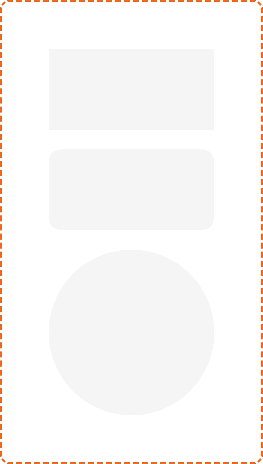
The Muba skeleton is a single, composable shape primitive available in three variants: rectangle, squircle, and circle. You combine multiple skeletons to build a placeholder that matches the exact layout of the content being loaded. This approach keeps the component simple while supporting any content structure across the app.
When to use
Use a skeletonr:
During initial page loads when the content structure is known in advance (workout cards, exercise lists, profile headers, feed posts).
For lazy loaded sections that appear below the fold while the user scrolls.
Anywhere the user would otherwise see a blank area for more than 300ms while data is being fetched.
Don't use a skeleton:
For indeterminate processes where you do not know the content structure. Use a spinner or loading info banner instead.
For very fast operations (under 300ms). No loading indicator is needed; the content should just appear.
For user initiated actions where the trigger element already has a loading state (e.g., a button with a spinner). The button loading state is sufficient.
For error states. If data fails to load, replace the skeleton with an error message or info banner, not a permanent skeleton.
Shapes
The skeleton component supports three shape variants via the shape property.
Rectangle
Sharp corners, no border radius. Used to represent text blocks, headers, labels, and any content with straight edges.
Fill: white (broz-bg/neutral/light/default). Width and height are set by the consumer based on the content being replaced.

Squircle
Rounded corners at 20px radius (responsive/layout/radius/xl). Used to represent cards, buttons, input fields, images with rounded corners, and any content with the standard brozz border radius.

Circle
Fully round (equal width and height with 50% border radius). Used to represent avatars, status indicators, and any circular element.

Structure
Each skeleton instance is a single filled shape with no internal elements. It uses a white fill (broz-bg/neutral/light/default) against the page background.
The skeleton does not have a fixed size. Width and height are determined by the layout it is mimicking. When building a skeleton screen, you compose multiple skeleton instances to match the layout of the real content:
Example: Workout card skeleton. One squircle for the card container, two small rectangles for the title and subtitle text, three narrow rectangles for the set rows, and a small circle for the avatar.
Example: Profile header skeleton. One large circle for the avatar, two rectangles for the name and bio text.
Example: Exercise list skeleton. Multiple squircle rows stacked vertically with consistent spacing.
Animation
Skeletons should use a subtle shimmer animation to communicate that content is loading. The shimmer is a left to right gradient sweep that repeats continuously.
The shimmer effect is applied to all skeleton instances on the screen simultaneously, creating a unified loading pulse rather than individual elements blinking independently.
When the real content is ready, the skeletons should be replaced immediately. No fade transition is needed because the content appearing is the reward.
Respect the prefers-reduced-motion system setting. When reduced motion is preferred, disable the shimmer animation and display static skeletons.
Placement
Skeletons must match the exact position and approximate size of the content they represent. The goal is that when the real content loads, it appears in the same location with no layout shift.
Place skeletons where the content will appear, using the same layout structure (same grid, same spacing, same alignment).
Don't use a single large skeleton to represent an entire screen. Break it down into individual shapes that match the content elements.
Don't animate skeletons into position. They should appear instantly when the loading state begins.
Accessibility
Reduced motion. The shimmer animation respects prefers-reduced-motion. Static skeletons with no animation are displayed instead.
Color independence. The white skeleton shapes on the peach/cream page background provide sufficient contrast to be visible without relying on the shimmer animation.
Best practices
Match the layout exactly. The whole point of a skeleton is to prevent layout shifts. If the skeleton does not match the real content's structure, the transition will feel jarring.
Use the right shape for the right element. Rectangles for text, squircles for cards and buttons, circles for avatars. Mixing shapes incorrectly (e.g., a rectangle where an avatar circle belongs) breaks the illusion.
Keep the loading duration short. Skeletons work well for 300ms to 3 seconds of loading. If loading takes longer than 3 seconds, consider adding a text hint below the skeletons explaining what is happening (e.g., "Loading your workout history...").
Never show skeletons permanently. If data fails to load, replace the skeletons with an error state or empty state. A skeleton that never resolves is worse than no loading indicator at all.
Compose skeleton screens per page, not per component. When building a skeleton for a full screen (like the home page), design the entire skeleton layout as one composition so the spacing and proportions feel cohesive.
