Progress bar
A progress bar displays the completion status of a task or process through a horizontal fill indicator. It shows how much of an operation has been completed and how much remains, with an optional label and percentage readout above the bar.
In Muba, progress bars track workout completion, set progress, and goal advancement such as showing how far through a program the user is, weekly training volume versus target, or onboarding step completion. The bar uses the brand orange fill with a subtle glossy highlight effect that gives it a dimensional, premium feel rather than a flat fill.
When to use
Use a progress bar:
To show deterministic progress toward a known goal (e.g., "4 of 6 sets completed", "Week 3 of 8 in program").
To visualize a percentage or ratio (e.g., "76% of weekly volume target reached").
Anywhere you need to motivate the user by showing how far they have come and how close they are to finishing.
Don't use a progress bar:
For indeterminate loading where you do not know the total (e.g., syncing an unknown number of records). Use the loading info banner or a spinner instead.
For binary states (complete or incomplete). Use a checkbox or badge instead.
For multi step flows where the user needs to see individual steps. Use a step indicator or segmented progress pattern instead.
Sizes
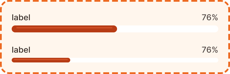
The progress bar supports two sizes.
Large
36px total height. The content row (label + percentage) is 20px tall, followed by a 4px gap, then the 12px tall bar. Use large as the default in most contexts where the progress bar is a primary element on the screen.
Medium
32px total height. A more compact version with slightly reduced spacing. Use medium when the progress bar appears inside cards, list items, or other tight layouts where vertical space is limited.
Structure
The progress bar is composed of two main layers stacked vertically with a 4px gap.
Content row
A horizontal row spanning the full width of the component. It contains:
Label (left aligned) in primary text color (broz-content/neutral/primary, #090808), Inter Medium 14px/20px. Describes what the bar is tracking. Can be hidden via the showLabel prop.
Percentage (right aligned) in secondary text color (broz-content/neutral/secondary, #544d4b), same font style. Shows the current progress as a number. Can be hidden via the showPercentage prop.
The entire content row can be hidden via the showContent prop, leaving only the bar visible for contexts where the label and number are provided by surrounding UI.
Bar
A horizontal track with a dynamic fill:
Track uses a white background (broz-bg/neutral/light/default), 12px height, 16px border radius (fully rounded ends), and overflow: clip to contain the fill.
Fill uses the brand orange (broz-bg/interactive/strong/default, #b93c15), same 12px height and 16px radius. The fill width is proportional to the progress percentage. It includes a subtle highlight strip and inner shadow effects (button/button-primary effect style) that give the bar a dimensional, glossy appearance.
Interaction
The progress bar is non interactive. It is a display only component that reflects the current state of a process or goal.
The bar fill should update in real time when the underlying data changes (e.g., after logging a set, the bar should expand to reflect the new completion percentage). Use a smooth width transition (approximately 300ms ease) when the fill changes so the user perceives the progress visually.
When the bar reaches 100%, consider pairing it with a success feedback element (info banner, toast, or animation) to celebrate the achievement.
Placement
Progress bars appear inline with the content they relate to. Common placements include:
Inside program cards, showing progress through a multi week plan.
On the home screen, showing weekly training volume against a target.
Inside onboarding flows, showing step completion.
At the top of a workout session, showing sets completed versus total.
Place the progress bar near the content it describes. It should be clear from context what the bar is tracking without reading the label.
Don't use more than one progress bar per section. Multiple bars in close proximity are visually confusing. If you need to track multiple metrics, separate them into distinct sections with clear headings.
Accessibility
Color independence. The fill communicates progress through its width, not just its color. Even in grayscale, the filled versus empty portion of the track is clearly visible due to the contrast between the dark fill and white track.
Reduced motion. The fill width transition should respect prefers-reduced-motion. When reduced motion is preferred, update the fill width instantly without animation.
Content
Label text should:
Describe what is being tracked in 1 to 3 words: "Weekly volume", "Program progress", "Sets completed".
Use sentence case.
Be a noun phrase, not a sentence.
Percentage text should:
Show the value as a number followed by the percent sign: "76%", "100%", "0%".
Update in real time as the underlying data changes.
Show "0%" at the start, not an empty string or a dash.
"Weekly volume" with "76%" is good. Clear label, precise number.
"You have completed 76% of your weekly training volume target" is bad. This is a label, not a sentence. Keep it short.
Best practices
Always start the bar at 0% and fill it proportionally. Never start at a non zero value unless there is preexisting progress to reflect.
The glossy highlight and inner shadow on the fill bar are part of the Muba visual identity. Do not flatten the bar to a plain fill. These effects make the progress bar feel premium and alive.
When the bar reaches 100%, hold it at 100% visually rather than resetting immediately. Give the user a moment to see the completed state before transitioning to the next screen or collapsing the bar.
Use the
showContentprop to hide the label and percentage when the surrounding context already provides that information (e.g., if the progress bar is inside a card that already has a "4 of 6 sets" label).For very small progress values (under 5%), ensure the fill is still visually perceptible. A minimum fill width of approximately 12px (matching the bar height) prevents the fill from appearing invisible at low percentages.
