Info banner
An info banner displays a non blocking message to the user inside a colored container with a leading icon. It communicates feedback, status updates, tips, or contextual information without interrupting the user's flow.
In Muba, info banners provide feedback and contextual guidance throughout the app: confirming a workout was saved, warning about offline mode, celebrating a new PR, flagging a sync error, showing a loading process, or surfacing AI generated insights. The banner's color and icon immediately communicate the nature of the message, making it scannable in under a second.

When to use
Use an info banner:
To confirm a successful action ("The changes you made were saved!").
To warn the user about a condition that does not block them but requires awareness ("You are offline. Changes will sync when you reconnect.").
To surface errors that need attention but do not prevent other interactions ("Sync failed. Tap to retry.").
To indicate a background process is in progress ("Syncing your workout data...").
To provide helpful tips or contextual information ("Tip: You can swipe left on a set to delete it.").
Don't use an infobanner:
For critical errors that block the user entirely. Use a modal or full screen error state instead.
For field level validation feedback (e.g., "This email is invalid"). Use the input component's built in error state instead.
For transient confirmations that should disappear automatically after a few seconds. Use a toast/snackbar pattern instead.
For long explanations or multi paragraph content. Keep banner text to 1 to 2 sentences maximum.
Variants
The info banner supports 7 semantic variants. Each variant uses a coordinated set of background, border, icon, and text colors that communicate the nature of the message at a glance.
Brand
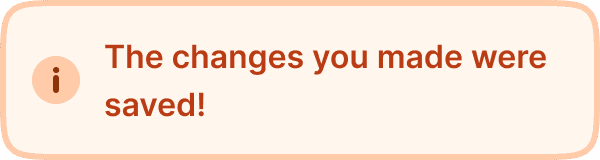
Orange/peach background with an orange border and an info circle icon. Used for general informational messages related to the app, features, or the Muba brand. This is the default variant for neutral announcements and tips.
Loading
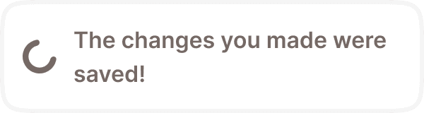
Neutral/gray background with a subtle border and a spinner icon. Used to indicate that a background process is in progress: syncing data, uploading a workout, processing a request. The spinner animates continuously to communicate ongoing activity.
Success
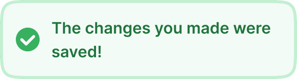
Light green background with a green border and a checkmark icon. Used to confirm that an action completed successfully: workout saved, PR recorded, settings updated, sync complete.
Danger
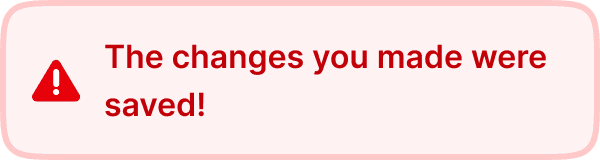
Light red background with a red border and an alert triangle icon. Used for important issues that need user attention: failed sync, expired subscription, data conflict.
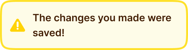
Warning
Light yellow background with a yellow border and a warning triangle icon. Used for cautionary messages that do not block the user but require their awareness: offline mode, upcoming maintenance, deload week reminder.
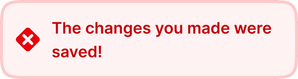
Error
Pink background with a red border and a cross/error icon. Used for errors that are more severe than danger but still non blocking: network failure, failed save, server error.
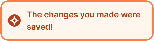
AI
Same peach background as Brand but with a stronger orange border (broz-borders/interactive/strong/default) and an AI/sparkle icon. Used exclusively for messages generated by or related to AI features: AI generated workout suggestions, smart recommendations, automated insights.
Display modes
The info banner has a static property that toggles between two presentations. The variant colors and icon are identical in both; only the elevation, text size, and text width change.
Default (static off)
A flat container with the 3px border and no shadow, up to 300px wide, with the message in body text (16px/24px) that fills the space beside the icon. Used when the banner sits in the page layout and pushes content below it down.
Static (static on)
The same bordered container gains a soft drop shadow (shadow/sm) and switches to the more compact note text (14px/20px) in a fixed width column. Used when the banner is presented as an elevated, free standing element rather than occupying space in the flow.
Structure
Each info banner is composed of two elements inside a colored container:
Leading icon is a 24x24px semantic icon on the left side. Each variant uses a different icon shape (info circle, spinner, checkmark, warning triangle, alert, cross, sparkle) to reinforce the meaning without relying on color alone. The icon can be hidden via the icon prop when the context makes the variant meaning self evident.
Content text fills the remaining space to the right of the icon. In the default mode it uses Inter Semi Bold at 16px/24px (text/content/body/emphasis); in static mode it uses the more compact Inter Semi Bold at 14px/20px (text/content/note/emphasis). The text wraps within the container width.
Container uses a 3px solid border (border/lg), 16px border radius (radius/lg), and a 12px gap between the icon and text. The default mode uses 16px padding on all sides, a maximum width of 300px, and no shadow; the static mode uses 16px horizontal / 12px vertical padding and adds the shadow/sm drop shadow.
Interaction
Info banners are non interactive by default. They are display only components that communicate information.
The loading variant's spinner icon animates continuously. The banner itself remains static while the spinner rotates.
If an actionable banner is needed (e.g., "Sync failed. Tap to retry."), the entire banner or a specific text link within it can be made tappable. In this case, the banner should provide pressed state feedback (slight darkening) and the action should be clearly communicated in the text.
Info banners do not dismiss automatically. They remain visible until the condition they describe is resolved. The loading variant disappears when the process completes, typically replaced by a success or error variant.
Placement
Info banners appear at the top of the content area they relate to, pushing content below them down. They sit below the header/navigation and above the main content.
Place the banner at the top of the relevant content section, not floating over content.
Don't overlay banners on top of other elements. They should push content down and occupy their own space in the layout.
When multiple banners need to be shown simultaneously (rare), stack them vertically with 8px spacing. Limit to 2 banners maximum. If more are needed, consolidate the messages.
Accessibility
Color independence. Each variant uses a unique icon shape (info circle, spinner, checkmark, triangle, alert, cross, sparkle) in addition to its color. Users who cannot perceive color can identify the banner type from the icon alone.
Contrast. All text/background combinations meet the WCAG 2.1 AA minimum contrast ratio of 4.5:1.
Reduced motion. The loading spinner should respect the prefers-reduced-motion system setting. When reduced motion is preferred, replace the spinning animation with a static loading icon or a pulsing dot.
Content
Banner text should:
Be 1 to 2 sentences maximum. If you need more, link to a detail page.
Start with the outcome or situation, not with "Note:" or "Warning:". The icon and color already communicate the severity.
Be specific about what happened and what the user can do (if applicable).
Use sentence case.
"The changes you made were saved!" is good for a success banner. Clear, confirms the action.
"Syncing your workout data..." is good for a loading banner. Tells the user what is happening.
"You are offline. Your workout will sync automatically when you reconnect." is good for a warning banner. States the situation and resolves the concern.
"Sync failed. Please try again." is good for an error banner. States the problem and suggests the action.
"Warning: An error has occurred. Please contact support if the issue persists." is bad. Starts with a redundant label ("Warning"), uses vague language, and does not give a clear next step.
"Error" is bad. No context, no guidance, no actionable information.
"Loading..." is acceptable but vague for a loading banner. Prefer specific descriptions like "Uploading your workout..." or "Syncing with server..."
Best practices
Use the variant that matches the message severity. Do not use a success banner for a warning, even if you prefer the green color. The meaning must be consistent across the app.
The AI variant is reserved for AI generated content. Do not use it for general brand messages. This distinction helps users learn to recognize and trust AI driven insights.
The loading variant should transition to a success or error variant once the process completes. Never leave a loading banner visible indefinitely. If a process takes more than 30 seconds, update the text to indicate it is still working.
Keep the icon visible in most cases. The only reason to hide it (via the
iconprop) is when the banner is used inside a very tight layout where 24px of horizontal space matters, or when the same variant is used repeatedly in a stacked list and the repetition becomes visually noisy.Avoid stacking more than 2 banners. If a screen needs 3 or more banners, consolidate messages or rethink the UX flow.
The 3px border is thicker than typical UI borders. This is intentional. It ensures the banner is clearly distinguishable from surrounding content, especially in bright gym environments where subtle visual cues get lost.
