Chips
A chip is a compact, interactive element used to filter, select, or toggle a category. Users tap a chip to activate or deactivate it, switching between an unselected and selected state. Each chip displays a leading icon and a short text label.
In Muba, chips are used for filter selections and toggleable criteria such as filtering workouts by muscle group, selecting exercise categories, toggling equipment types, or choosing training splits. They are designed to be tapped rapidly in sequence, letting users build up a set of active filters in a few quick taps.
When to use
Use a chip:
For toggleable filter options where the user can select one or more from a set.
When the user needs to see all available options at once and toggle them on/off.
In horizontal scrolling rows or wrapping grids where multiple selections need to be compact.
Don't use a chip:
For non interactive labels or status indicators. Use a badge instead.
For user generated tags that can be added and removed freely. Use a tag component instead.
For mutually exclusive choices where only one can be active. Use radio buttons or a segmented control instead.
For actions that trigger navigation or operations. Use a button instead.
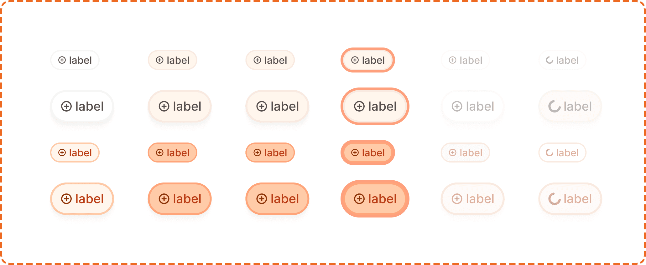
Sizes
The chip supports two sizes.
Small (32px)
The default size. 79px wide, 32px tall. Used in most filter contexts where space is limited, such as horizontal filter bars and compact lists.
Large (52px)
A taller variant at 102px wide and 52px tall. Used when the chip needs greater visual presence or a larger touch target, such as in onboarding flows, preference screens, or prominent filter sections.
Selection modes
Each toggle instance is composed of
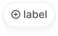
Inactive (active?=no)
The chip is not selected. It displays a light neutral background with a subtle border. The icon and label appear in muted tones. The chip is available to be tapped.
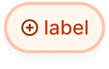
Active (active?=yes)
The chip is selected. The background fills with a warm orange tint matching the brand palette. The icon and label appear in a stronger orange/brown tone. An active chip remains tappable so the user can deselect it.
Interaction
Each selection mode (inactive, active) supports 6 interaction states:
Default is the resting state. The chip is visible at full opacity, ready for interaction.
Hovered provides a subtle background shift on desktop when the cursor is over the chip.
Pressed gives immediate visual feedback during a tap or click. The chip darkens slightly to confirm the touch.
Focused displays a visible orange focus ring around the chip for keyboard and assistive technology navigation.
Disabled reduces the chip to low opacity with no pointer events. The chip retains its current selection mode (inactive or active) visually but cannot be changed.
Loading replaces the leading icon with a small spinner. The chip is non interactive while loading. This is used when activating a chip triggers an asynchronous operation (e.g., fetching filtered results from the server).
Toggle behavior
Tapping an inactive chip switches it to active.
Tapping an active chip switches it back to inactive.
Multiple chips can be active simultaneously within the same group (non exclusive selection).
The chip does not submit a form or navigate. It only toggles its own state.
Structure
Each chip contains two elements in a horizontal row:
Leading icon is a small circular icon on the left side. It provides a visual hint about the chip's category. The icon color shifts between muted (inactive) and orange (active) to reinforce the selection state.
Label is the text content of the chip. It sits to the right of the icon. The text color also shifts between muted and orange/brown depending on the active state.
Both sizes use the same structural layout. The large size simply scales up the padding, icon size, and text size proportionally.
Placement
Chips appear in horizontal rows or wrapping grids. The most common placement is a horizontal scrolling row at the top of a list or content area, acting as a filter bar.
Arrange chips in a horizontal row with consistent spacing (8px gap). If the row overflows the screen width, allow horizontal scrolling.
When chips are used in a settings or preference screen where space is not constrained, arrange them in a wrapping grid so all options are visible without scrolling.
Don't stack chips vertically in a single column. This layout does not communicate that they are a selectable group.
Accessibility
Touch target. Small chips are 32px tall, which is below the 44px minimum. Use invisible padding to expand the tappable area to at least 44px vertically. Large chips at 52px already exceed the minimum and do not need additional padding.
Keyboard. Tab to move between chips. Space or Enter to toggle the selection. Arrow keys to navigate within a chip group.
Screen reader. Announce the label, role ("filter" or "option"), and current state ("selected" or "not selected"). For example: "Chest, filter, selected."
Focus indicator. The focused state displays an orange outline around the chip, clearly visible against both the inactive and active backgrounds.
Color independence. The active state uses three simultaneous signals: background color change (neutral to orange tint), icon color change, and text color change. Additionally, the visual weight of the entire chip increases when active, making the state perceivable even in grayscale.
Loading state. When loading, the spinner replaces the icon and the chip is announced as "loading" to screen readers. The label remains visible so the user knows which filter is being applied.
Content
Chip label copy should:
Be 1 to 2 words maximum. Chips are compact by design.
Use sentence case.
Be a category noun or short descriptor: "Chest", "Upper body", "Barbell", "Push", "Legs".
Be parallel in structure when displayed as a group. If one chip says "Chest", the others should also be body part nouns, not verbs or sentences.
"Chest" is good. Short, clear, scannable.
"Upper body" is good. Two words, still fits the chip width.
"All exercises targeting the chest area" is bad. Far too long for a chip. Use a badge or inline text for this.
Best practices
Chips work best in groups of 3 to 10 options. Fewer than 3 and radio buttons or a segmented control might be more appropriate. More than 10 and the list becomes hard to scan; consider using a dropdown or search and filter pattern instead.
When used as filters, show the results count or update the visible content immediately when a chip is toggled. Delayed feedback makes the chip feel broken.
Provide a "Clear all" or "Reset" option when multiple chips can be active, so users can quickly start over.
The loading state should be used sparingly. For most local filter operations, the result should update instantly. Only show the loading spinner when a network request is required.
Don't mix small and large chips in the same group. Pick one size and use it consistently across all chips in that context.
