Badge
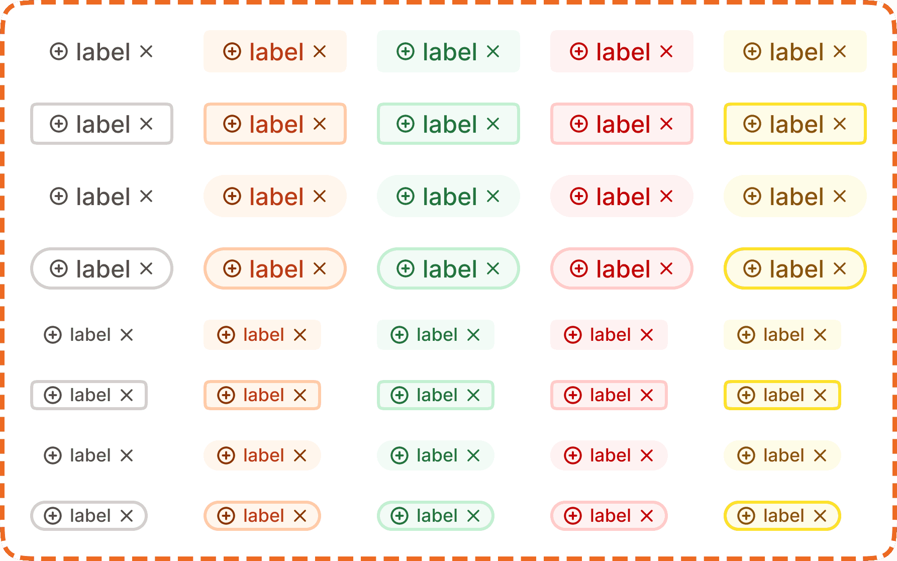
A badge is a small, compact label used to categorize, tag, or communicate status. Each badge displays an icon, a text label, and a dismiss button ("x"). Badges come in five semantic color variants and can switch between filled and outlined styles, as well as square and pill (rounded) shapes.
In Muba, badges are used to label and categorize content across the app: tagging muscle groups on workout cards ("Chest", "Upper body"), showing equipment type ("Free weights", "Machine"), indicating workout status ("Completed", "Missed"), and flagging content ("New", "Premium"). Their compact size and color coding make them instantly scannable in lists, cards, and headers.
When to use
Use a badge:
To categorize content with short labels (muscle groups, equipment types, workout tags).
To communicate status with semantic meaning (success, danger, warning).
To display removable filters or applied selections where the user can dismiss individual items.
Inline with other content like card headers, list items, or exercise descriptions.
Don't use a badge:
For interactive selections where the user toggles between selected and unselected. Use a chip instead.
For notification counts (like "3 new messages"). Use a count indicator on the avatar or icon instead.
For long text. Badges should contain 1 to 3 words maximum. If you need more, use a banner or inline text.
As buttons or action triggers. Badges are informational. The only interaction is dismissing them via the "x".
Variants
The badge supports 5 semantic color variants. Each variant uses a coordinated set of background, border, icon, and text colors that communicate a specific meaning.
Neutral
The default/inactive mode. The track appears in a muted gray color with a white thumb positioned on the left side. The setting is not active.
Brand
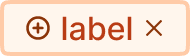
Orange/brand tones. Used for content related to the Muba brand or highlighted categories: "Featured", "Recommended".
Success
Green tones. Used to indicate positive outcomes or completed states: "Completed", "PR", "New record".
Danger
Red tones. Used to flag issues, errors, or destructive labels: "Missed", "Overdue", "Failed".
Warning/Upgrade
Yellow tones. Used for cautionary labels that require attention but are not critical.
Styles
Each variant can be displayed in two visual styles controlled by the outline? and rounded? property.
Filled (outline?=no)
The badge has a colored background fill with matching icon and text colors. This is the default and most visually prominent style. Use filled badges when the label needs to stand out against the surrounding content.
Outlined (outline?=yes)
The badge has a transparent background with a colored border, icon, and text. This is a lower emphasis style. Use outlined badges when you need the label to be present but less visually dominant, such as when multiple badges are stacked together and a filled style would be too heavy.
Square (rounded?=no)
Uses a moderate border radius for a rectangular appearance. This is the default shape used in most contexts.
Pill (rounded?=yes)
Uses a fully rounded border radius (pill shape). Use the pill shape when badges appear in contexts with other rounded elements (like inside pill shaped input fields or alongside avatars) to maintain visual consistency.
Size (lg=yes)
Two sizes are available for the badge component Small and Large.
Structure
Leading icon is a small circle or semantic icon on the left side. It matches the variant color and reinforces the badge's meaning at a glance.
Label is the text content of the badge. It uses a compact font size to keep the badge small. The text color matches the variant.
Dismiss button ("x") sits on the right side. Tapping it removes the badge. The "x" icon matches the variant color.
Interaction
Badges are primarily informational, but the dismiss button ("x") makes them partially interactive.
Tapping the "x" removes the badge from the current context. This is used when badges represent applied filters or user added tags that can be cleared.
If the badge is not dismissible (used purely as a label), the "x" can be hidden. In this case, the badge becomes fully non interactive.
Badges do not have hover, pressed, focused, or disabled states on the badge itself. Only the dismiss "x" responds to interaction.
Placement
Badges appear inline with the content they describe. Common placements include:
Inside workout card headers, next to the exercise name, to show muscle groups and equipment.
In filter bars, showing the currently applied filters with dismiss functionality.
In list items, next to labels, to indicate status or category.
When using multiple badges together, arrange them in a horizontal row that wraps to the next line if it exceeds the available width. Use consistent spacing (4 to 8px gap) between badges.
Don't stack badges vertically unless they are inside a narrow container where horizontal space is limited.
Accessibility
Touch target. The badge itself is 28px tall, which is below the 44px minimum. When the badge is dismissible, ensure the "x" button uses invisible padding to expand its tappable area to at least 44x44px.
Screen reader. Announce the badge label and variant meaning: "Chest, tag" or "Completed, status." For dismissible badges, announce "Chest, tag, removable" and "remove Chest" for the dismiss button.
Color independence. Each variant uses both a distinct color and a leading icon. The icon shape differs per variant (circle for neutral, brand icon for brand, checkmark for success, cross for danger, warning symbol for warning), ensuring the meaning is not communicated through color alone.
Keyboard. If dismissible, the "x" button must be reachable via Tab and activated with Enter or Space.
Content
Badge label copy should:
Be 1 to 3 words maximum. Badges are compact by design.
Use sentence case.
Be a noun or short descriptor, not a sentence: "Chest", "Free weights", "Completed", "New".
Match the semantic variant. Don't use a success (green) badge for a label that means "danger" or "warning." The color and the label must agree.
"Chest" in a neutral badge is good. Clear, short, descriptive.
"Upper body" in a neutral badge is good. Two words, still scannable.
"This exercise targets the upper body muscles including chest and shoulders" is bad. Far too long for a badge. Use a tooltip or description for this.
"Error" in a danger badge is too generic. Be specific: "Missed", "Failed sync", "Incomplete."
Best practices
Badge label copy should:
Use one variant consistently for one type of meaning. If "success" badges mean "completed" in one place, they should mean "completed" everywhere. Don't mix meanings across screens.
Prefer filled badges for primary categorization and outlined badges for secondary or supplementary labels.
Limit the number of badges per item to 3 or fewer. More than 3 creates visual clutter and defeats the purpose of quick scanning.
When badges represent user removable filters, always provide a "Clear all" option alongside individual dismiss buttons.
The 5 variant system (neutral, brand, success, danger, warning) covers most use cases. If you find yourself needing a sixth color, reconsider whether the content should be a badge or a different component.
