Avatar
An avatar is a visual representation of a user, displaying either a profile photo or initials as a fallback. It can include a status indicator to show whether the user is online, offline, or has a special badge. Avatars also come in a grouped variant that displays multiple users in a compact, overlapping row.
In Muba, avatars are central to the social experience. They appear on workout feed cards, friend lists, leaderboards, shared workout sessions, and profile headers. The grouped variant shows participants in shared workouts and challenges, making it immediately clear who is involved.
When to use
Use an avatar:
To represent a user visually anywhere their identity needs to be communicated (profiles, cards, lists, feeds).
To indicate online/offline status in social contexts.
To show a group of participants in a shared workout or challenge (grouped variant).
Don't use an avatar:
For generic icons or decorative images. Use the icon component instead.
For brand logos or app icons. Use the dedicated logo component instead.
When displaying a user's full name is sufficient and no visual identifier is needed.
Types
Single avatar
Represents one user. This is the primary avatar component used throughout the app.
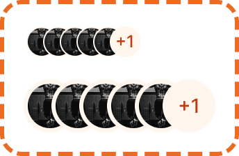
Grouped avatar
Displays multiple users in a horizontal row with overlapping avatars and a "+N" count badge showing how many additional users are not displayed. Used for shared workouts, challenge participants, and friend groups.
The grouped variant is available in two sizes: sm and md.
Sizes
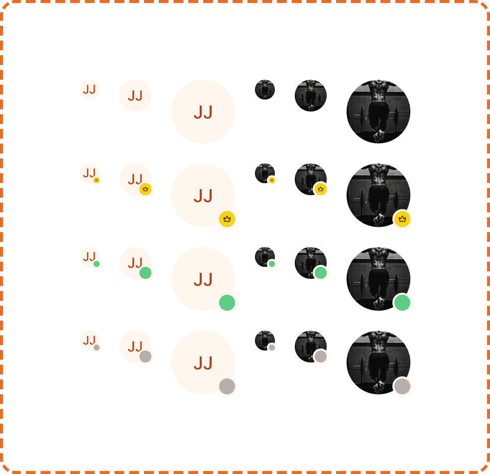
The single avatar supports three sizes. Each size scales the photo/initials circle and the status indicator proportionally.
Small (20px)
Used inline with text, in compact list rows, and inside the grouped avatar variant. The status indicator at this size is 6px.
Medium (32px)
The default size for most contexts: friend lists, workout cards, feed posts, comments. The status indicator at this size is 12px.
Large (64px)
Used for profile headers, large cards, and any context where the avatar needs strong visual presence. The status indicator at this size is 16px.
Content modes
The avatar has two content modes controlled by the placeholder?property.
Photo (placeholder?=no)
Displays the user's profile photo as a circular image. This is the preferred mode whenever a photo is available.
Placeholder / Initials (placeholder?=yes)
When no photo is available, the avatar shows the user's initials (e.g., "JJ") on a light peach background. The initials are derived from the user's first and last name. This ensures every user always has a visual representation, even before they upload a photo.
Status indicator
The avatar indicator is a small dot positioned at the bottom right corner of the avatar circle. It communicates the user's current status. The indicator is a nested component with its own size scale that corresponds to the parent avatar size.
None
No indicator is displayed. Used when status is irrelevant to the context (e.g., static profile pages, historical workout cards).
Online
A green dot. Indicates the user is currently active in the app.
Offline
A gray dot. Indicates the user is not currently active.
Company / Badge
A small emoji or icon badge (e.g., star, smiley). Used for special statuses like "premium user", "challenge winner", or custom flair. This is positioned the same way as the online/offline dot but replaces the circle with a small icon.

Placement
Single avatars appear to the left of or above the content they are associated with (user name, workout card, comment).
In list rows, the avatar sits at the leading edge (left side) followed by the user's name and metadata.
In cards, the avatar can appear in the header area next to the author's name.
Grouped avatars appear inline with content that references multiple participants: "Shared with [avatars]" or inside challenge/leaderboard headers.
Accessibility
Alt text. Photo avatars must include the user's name as alt text (e.g., alt="Jordan J."). Placeholder avatars should also have the name as alt text, since the initials alone may not be sufficient for screen readers.
Screen reader. For single avatars: announce the user's name and status ("Jordan J., online"). For grouped avatars: announce the total count ("5 participants, showing Jordan, Alex, and Sam").
Color independence. The online indicator uses green and the offline indicator uses gray, but they are also differentiated by their filled/unfilled appearance. The company/badge status uses a completely different shape (emoji icon) that does not rely on color.
Touch target. Avatars are not interactive by default. When they are tappable (e.g., linking to a profile), ensure the tappable area extends to at least 44x44px using invisible padding, especially for the sm (20px) size.
Content
Initials should use 1 to 2 uppercase letters derived from the user's first and last name. If only a first name is available, use the first two letters. Never show more than 2 characters.
Status labels (for screen readers) should use plain language: "online", "offline", "premium member." Avoid technical terms like "active session" or "idle."
Grouped count should show "+N" where N is the number of additional users not visible. "+1" means one more person. "+12" means twelve more. Never show "+0."
Best practices
Always provide a fallback. If a user has no photo, show initials. If initials cannot be derived (no name data), show a generic person icon as a last resort.
Use the status indicator only in social and real time contexts where knowing if someone is online matters (friend list, shared workout, chat). Don't show it on static content like workout history cards.
For the grouped variant, keep the visible count to 3 or 4 avatars maximum. Showing more creates a cluttered row that is hard to parse at a glance.
The peach background color for placeholder avatars is intentional. It uses the brand's warm palette to feel cohesive rather than using a cold gray default. Do not change the placeholder background to gray or any other color.
When an avatar is tappable, provide visual feedback on press (slight scale or opacity change) to confirm the interaction.
