Tabs
Tabs organize content into multiple panels, allowing users to switch between views within the same screen without navigating away. Only one tab is active at a time. Tapping a different tab switches the visible content below it instantly.
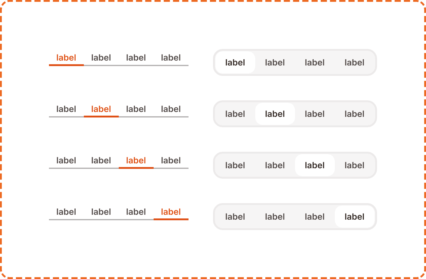
In Muba, tabs structure content heavy screens like the workout library (templates vs programs). Tabs keep everything accessible within a single screen, reducing navigation depth and making the app feel fast. The component supports two visual styles: underline and pill.
When to use
Use tabs:
To organize related content into 2 to 4 parallel sections on the same screen.
When the user needs to switch between views frequently without losing context.
When each section contains a different type or category of the same data (e.g., different workout types, different social feeds).
Don't use tabs:
For sequential steps in a flow. Use a stepper or progress indicator instead.
For filtering the same list by criteria. Use chips or a dropdown filter instead.
When there are more than 4 sections. Consider a different navigation pattern or consolidate content.
For primary navigation between major app areas. Use the tap bar instead.
Styles
The tabs component supports two visual styles controlled by the pills-variant?property.
Underline (pills-variant?=no)
A clean, minimal style. The selected tab displays orange text with a solid orange underline bar below it. Unselected tabs show muted gray text with no underline. The tab row is 28px tall.
Use underline tabs as the default style in most contexts. They are lightweight and let the content below them take visual priority.
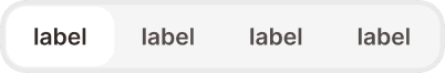
Pill (pills-variant?=yes)
A more prominent style. The selected tab displays text inside a filled pill with a light background tint and a visible border. Unselected tabs show text inside a subtle outlined pill. The tab row is 44px tall.
Use pill tabs when the tabs themselves need stronger visual presence, such as at the top of a modal, inside a card, or in a context where the underline style would be too subtle against the background.
Master tab
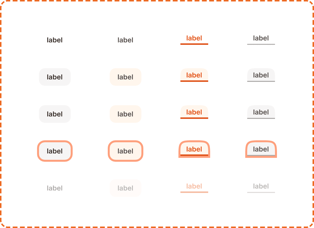
Each individual tab item is an instance of the master tabs component. It has three properties:
selected? controls whether this tab is the active one. When selected (yes), the tab uses its active visual treatment (orange text + underline, or filled pill). When unselected (no), it uses the inactive treatment (gray text, no underline, or outlined pill).
pill? controls the visual style and mirrors the parent's pills-variant? property. When no, the tab renders as underline style (57x28px). When yes, it renders as pill style (65x36px).
state controls interaction feedback. Each tab supports 5 states:
Default is the resting state. The tab is visible and ready for interaction.
Hovered provides a subtle visual shift on desktop when the cursor is over the tab.
Pressed gives immediate feedback during a tap or click.
Focused displays a visible focus ring for keyboard and assistive technology navigation.
Disabled reduces the tab to low opacity. The section it represents is temporarily unavailable.
Interaction
Tapping a tab switches the active selection immediately. The content below the tabs transitions to the corresponding panel.
The tab bar itself remains fixed while the content below changes. The transition between panels should be instant or use a very short cross fade (under 150ms). Avoid slide animations that imply sequential ordering, since tabs represent parallel content, not a sequence.
Tapping the already selected tab has no effect. It does not refresh or scroll the content.
All tabs remain visible at all times. Do not hide or collapse inactive tabs.
Placement
Tabs sit at the top of the content area they control, below the screen header and above the panel content.
Place tabs directly above the content they organize. The relationship between the tabs and the panel below must be visually clear.
Don't float tabs detached from their content. The tab bar and the content panel should feel like one connected unit.
For underline tabs, the row sits flush with the content below. For pill tabs, add a small amount of vertical spacing (8 to 12px) between the tabs and the content to give the pills breathing room.
The tab row spans the full available width. Tabs distribute evenly across the width. If the labels are very short, allow some extra horizontal padding to prevent the tabs from clustering in the center.
Accessibility
Focus indicator. The focused state displays a visible focus ring around the tab item (both underline and pill styles).
Color independence. The selected underline tab uses both orange text and a visible underline bar. The selected pill tab uses both a filled background and a border. Unselected tabs have a distinctly different visual weight regardless of color perception.
Content
Tab labels should:
Be 1 to 2 words maximum: "Templates", "Programs", "History", "Stats".
Use sentence case.
Be parallel in structure. If one tab is a noun ("Templates"), all tabs should be nouns, not a mix of nouns and verbs.
Describe the content of the panel, not an action. "History" not "View history."
"Templates", "Programs", "History" is a good tab set. Short, parallel, descriptive.
"My templates", "Browse programs", "See workout history" is a bad tab set. Inconsistent structure, too long, uses verbs..
Best practices
Use 2 to 4 tabs. Fewer than 2 makes tabs pointless. More than 4 makes the labels too small on mobile and overwhelms the user with choices.
Choose one style (underline or pill) and use it consistently within the same context. Do not mix underline and pill tabs on the same screen.
Default to the underline style unless the pill style is needed for visual distinction. Underline is more lightweight and works in more contexts.
The first tab (position 1) should be the most commonly accessed content. It is the default view when the user arrives on the screen.
Tab content should load instantly if possible. If a panel requires data fetching, show a skeleton inside the panel while keeping the tab bar visible and interactive. Never block the entire tab bar while one panel loads.
Do not use tabs to hide critical information that the user must see. Every tab panel should be equally discoverable.
