Footer actions
A footer action is a persistent bar pinned to the bottom of the screen that holds primary actions. It uses a gradient fade at the top so content scrolling behind it blends smoothly, keeping the actions always visible and reachable without covering content abruptly.
In Muba, footer actions appear in creation, editing, and browsing flows. The component supports three layout types: a button pair for save/submit flows ("Add exercise" + "Save changes"), an in-workout control set for swapping and advancing exercises during a session, and a search with add button for browsing flows where the user can filter a list and add new items simultaneously.
When to use
Use a footer action:
When the user needs to complete or save something at the end of a flow (CTAs type).
When key actions must remain visible while scrolling long content (e.g., a workout with many exercises).
When the user needs to search and add items to a list simultaneously (search+actions type).
During an active workout, to swap the current exercise or move to the next one (in-workout type).
Don't use a footer action:
For actions that relate to a single item in a list. Use inline buttons or action buttons instead.
When there is only one action and the screen content is short enough that a standard inline button is always visible. No need to pin.
Inside modals or bottom sheets that already have their own action area.
On screens where the primary action is already handled by the action button (FAB). Having both creates hierarchy confusion.
Types
The footer action component supports different types via the type property.
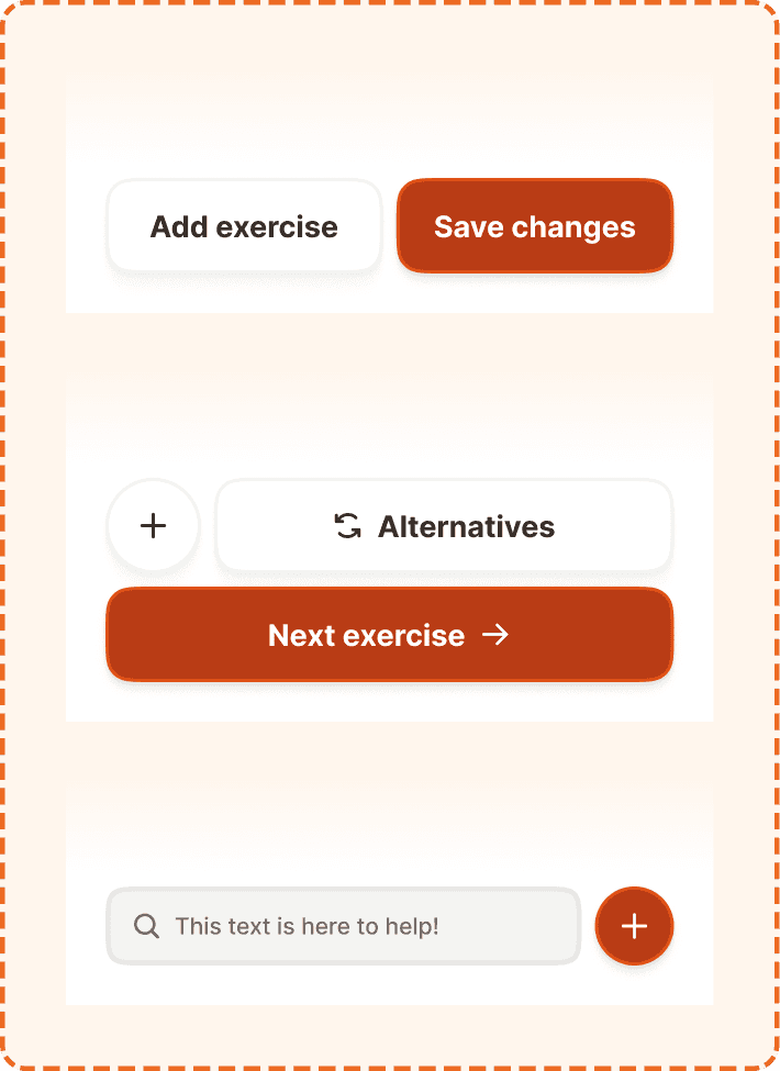
CTAs
The standard button pair layout. Contains a primary button and an optional secondary button side by side. Used in creation and editing flows where the user needs to save, confirm, or proceed.
Primary button (right side) uses the brand orange fill (broz-bg/interactive/strong/default), white text, 58px height, 16px radius, medium shadow (shadow/md). Both buttons use Inter Bold 18px (text/content/highlight/strong).
Secondary button (left side, optional) uses a white fill, neutral border (broz-borders/neutral/light/default), dark text, 58px height, 16px radius, small shadow (shadow/sm). Controlled by the showSecondary prop.
Both buttons use flex-1 to share the available width equally. When showSecondary is false, the primary button expands to fill the full width.
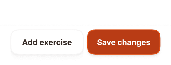
Search + actions
A search and create layout. Contains a search input field on the left and a circular add button on the right. Used in browsing flows where the user needs to filter a list while also having quick access to a create action.
Search input uses the master input component in search variant with showContent=false (no label, no description, just the field). It uses flex-1 to fill the available width. The field has a gray background (broz-bg/neutral/middle/default), 3px subtle border, 48px height, 12px radius, and a magnifying glass icon on the left.
Add button is a circular primary button (48x48px, fully rounded at 9999px) using the brand orange fill, a "+" icon, 2px border (broz-borders/interactive/stronger/default), and medium shadow (shadow/md).
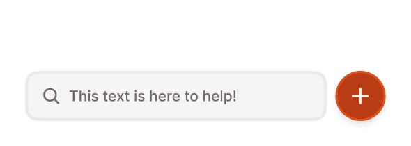
In workout
A two row control set for the active workout flow. The top row holds an optional circular icon button beside a white "Alternatives" button; a full width primary button sits below to advance the session. Used inside an active workout, below the exercise content and beneath the workout topper.
Secondary icon button (top row, left, optional) a circular 58px button with a white fill, neutral border (broz-borders/neutral/light/default), small shadow, and a single icon. Controlled by the showSecondary prop.
Alternatives button (top row, fills the remaining width) a white button with a neutral border and small shadow, 58px height, 16px radius, showing a swap icon and a label (e.g., "Alternatives"). Lets the user replace the current exercise with a similar one.
Primary button (full width, below) the brand orange fill (broz-bg/interactive/strong/default) with a stronger orange border (broz-borders/interactive/stronger/default), white text and a trailing arrow, 58px height, 16px radius, medium shadow (shadow/md). Advances the session (e.g., "Next exercise").
All buttons use Inter Bold 18px (text/content/highlight/strong).
Structure
Both footer action types share the same container structure, composed of two layers.
Gradient fade
A subtle cream to white gradient sits at the top of the footer (60px tall). It creates a smooth visual transition between the scrolling content above and the action bar below, avoiding a hard cut off.
Action container
The white bar holding the interactive elements. Uses 24px horizontal padding (matching the page margins), 8px top padding, 24px bottom padding (accounting for safe area), and an 8px gap between elements. White background (broz-bg/interactive/light/default).
Interaction
The footer itself is non interactive. Only the elements inside it respond to user input.
CTAs type
Both buttons follow standard button interaction states (default, hovered, pressed, focused, disabled, loading). If the primary action requires a network request, show a loading state on the button while keeping the footer visible and the secondary button tappable. Tapping the secondary button should never trigger a destructive action.
Search + actions type
The search input follows standard input interaction states (default, focused, typing, filled). Typing filters the list above the footer in real time. The circular add button follows standard button interaction states. Tapping it opens the relevant creation flow (e.g., "Add exercise" modal).
In workout type
All three buttons follow standard button interaction states. The icon button and "Alternatives" button are secondary actions; "Alternatives" opens the exercise swap flow. The full width primary button advances to the next exercise and shows a pressed state on tap. It stays the most prominent control in the set.
Placement
The footer action is always pinned to the absolute bottom of the screen, outside the scrollable content area.
Pin the footer to the bottom of the viewport, below all scrollable content.
Don't embed the footer inside a scroll view. It must remain fixed.
The gradient fade must overlap the bottom of the scrollable content area so that the transition feels seamless. Content should be able to scroll behind and beneath the gradient.
On devices with home indicators (iPhone with gesture navigation), the 24px bottom padding provides clearance above the safe area. Adjust this for Android navigation bars as needed.
Accessibility
Touch target. All interactive elements meet or exceed the 48px minimum. The CTAs and in-workout buttons are 58px tall, the search input and circular add button are 48px, and the in-workout icon button is 58px.
Safe area. On devices with home indicators, respect the system safe area inset. The 24px bottom padding accommodates this.
Best practices
Choose the right type for the context. Use CTAs when the user is completing a flow (saving, confirming). Use in-workout during an active session to swap or advance exercises. Use search+actions when the user is browsing a list and needs to filter and create simultaneously.
Do not mix the types on the same screen. Pick one and use it consistently.
The gradient fade is essential. Without it, content appears to be cut off abruptly. Always include it.
Keep the footer focused. The CTAs type holds at most two buttons, the search+actions type one input and one button, and the in-workout type a secondary row (icon plus "Alternatives") above a single full width primary. Do not add more.
The circular add button in the search+actions type is visually similar to the action button (FAB) but functionally different. The FAB opens a multi action popover. The footer add button triggers a single, context specific creation action. Do not confuse the two.
