Empty state
An empty state appears when there is no content to display in a given area. Instead of showing a blank screen, it communicates what is missing and provides clear actions to get started. It turns a dead end into an onboarding opportunity.
In Muba, empty states appear in high intent moments when a user opens the app for the first time and has no workouts, when they browse an empty template library, or when a list has not been populated yet. The component uses the brand's warm peach and orange tones to feel encouraging, not broken, and always includes at least one actionable CTA.
When to use
Use an empty state:
When a list, library, or collection has zero items and the user needs guidance on how to populate it.
On first time use screens where no data exists yet (no workout templates, no programs, no weight entries).
When a section is intentionally empty and the user needs to take action to fill it.
Don't use an empty state:
When data is loading. Use a skeleton component instead.
When there is an error preventing data from appearing. Use an info banner with an error variant instead.
When a search or filter returns no results. Use a simpler "no results" message with a reset action, not the full empty state card.
When the emptiness is temporary and will resolve on its own (e.g., waiting for a sync). Use a loading indicator instead.
Structure
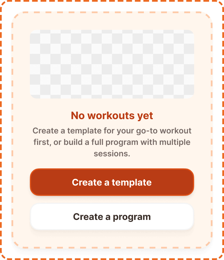
The empty state is a single self contained card component composed of four layers stacked vertically with a 16px gap.
Container
A dashed border card with a warm peach background (broz-bg/interactive/middle/default, #fff6ed) and an orange dashed border (broz-borders/interactive/middle/default, #ffcba8) at 3px thickness. The container uses 32px internal padding (padding/3xl), 12px border radius (radius/md), and a 16px gap (padding/xl) between the internal layers. The dashed border style is intentional: it signals that the area is waiting to be filled, like a placeholder.
Illustration
A 120px tall image area at the top of the card, spanning the full width of the container. It uses 12px border radius (radius/md) and object-cover to fill the space. This area holds a contextual illustration (e.g., a Bro mascot expression or a relevant graphic) that adds personality and visual warmth to the empty state.
Text block
Two lines of centered text stacked with a 4px gap:
Heading in orange/brown (broz-content/interactive/primary, #8a3408), Inter Bold 18px/26px (text/content/highlight/strong). A short, friendly statement of what is missing. This is a customizable prop (heading, default: "No workouts yet").
Content in muted gray (broz-content/neutral/tertiary, #756965), Inter Semi Bold 14px/20px (text/content/note/emphasis). A sentence telling the user what to do next and why. This is a customizable prop (content, default: "Create a template for your go-to workout first, or build a full program with multiple sessions.").
Button block
Two full width buttons stacked vertically with a 12px gap:
Primary button on top. Brand orange fill (broz-bg/interactive/strong/default), white text, 48px height, 16px radius, medium shadow (shadow/md). This is the main action (e.g., "Create a template").
Secondary button below. White fill, neutral border, dark text, 48px height, 16px radius, small shadow (shadow/sm). This is the alternative action (e.g., "Create a program"). The secondary button is optional and controlled by the showSecondary prop.
Interaction
The empty state container itself is non interactive. Only the buttons inside it respond to user input.
Both buttons follow standard button interaction states (default, hovered, pressed, focused, disabled, loading).
Tapping the primary button initiates the main creation action (e.g., opens the "Create a template" flow).
Tapping the secondary button offers an alternative path (e.g., opens the "Create a program" flow).
The empty state disappears once the user creates their first item. It is replaced by the actual content. No transition animation is needed because the content appearing is the reward.
Placement
The empty state appears centered in the content area where the list or content would normally be. It replaces the content, not overlays it.
Place the empty state where the content would be if it existed.
Don't place it at the top of the page above other content that does exist. It should occupy only the empty zone.
Don't overlay it on top of partially loaded content. Either the content exists or the empty state shows, never both.
On screens with a tab bar and a header, the empty state sits vertically centered in the remaining space between them.
Accessibility
Color independence. The dashed border plus peach background provide visual distinction through shape and texture, not just color. The heading uses a distinct text color plus a larger/bolder font weight.
Dynamic sizing. The heading and content text wrap to accommodate larger system font sizes. The container height grows accordingly. Buttons remain full width and adapt their text wrapping. The illustration maintains its 120px height regardless of font scaling.
Content
Empty state heading should:
State what is missing in plain, friendly language.
Be short: ideally 3 to 5 words ("No workouts yet", "No exercises added", "Empty library").
Use a direct, factual tone. The heading reports the situation, the content text provides the guidance.
Empty state content should:
Tell the user exactly what to do next and provide a reason.
Reference the primary and secondary actions by name when possible ("Create a template for your go-to workout first, or build a full program with multiple sessions.").
Be 1 to 2 sentences maximum.
Button labels should start with a verb and describe the outcome: "Create a template", "Create a program", "Add exercise", "Start workout".
Best practices
Every empty state must have at least one CTA. A message without an action is a dead end.
The primary button should always match the most obvious next step. If the user is on the template library, the primary should be "Create a template", not "Learn more".
Use the
showSecondaryprop to hide the secondary button when only one action makes sense in context. A single primary CTA is cleaner than a forced secondary.The illustration at the top adds personality and warmth. Use contextual illustrations (a Bro mascot expression, a relevant icon, or a simple graphic) that match the empty state's context. Avoid generic stock illustrations.
The dashed border style is reserved for empty states. Do not reuse it for other containers. It is a visual signal that means "this area is waiting to be filled."
Once the user creates their first item, the empty state should disappear instantly and be replaced by the real content.
