Workout card
A workout card is the primary content container for workout related entities in Muba. It represents a template, a program, an exercise, or a completed session in history, adapting its layout and content depending on the type. Workout cards are what users interact with dozens of times per session when browsing their library, building programs, and selecting exercises.
The component is designed to be instantly scannable. Users need to identify a workout template by its name and muscle groups, a program by its exercise structure, an exercise by its image and equipment type, or a past session by its date and summary, all in a quick glance while scrolling through a list.
When to use
Use a workout card:
To display a workout template in a library list, showing its name, description, and target muscle groups.
To show a program with its contained workouts and exercise counts.
To present an individual exercise in a selection or browsing context, showing its image, muscle groups, and equipment.
In any list where users browse, select, reorder, or manage workout related content.
To display a completed workout in the user's history or activity log, showing the date, session name, volume summary, and muscle groups trained.
Don't use a workout card:
For displaying an active exercise during a workout session with its set table. Use the exercise expanded variant (a separate component for the active workout flow).
For user profiles, social content, or non workout data. Use a generic list item or card pattern instead.
For settings or preferences. Use list items with appropriate accessories instead.
Types
The workout card supports 3 types via the type property. Each type has a distinct layout optimized for the content it represents.
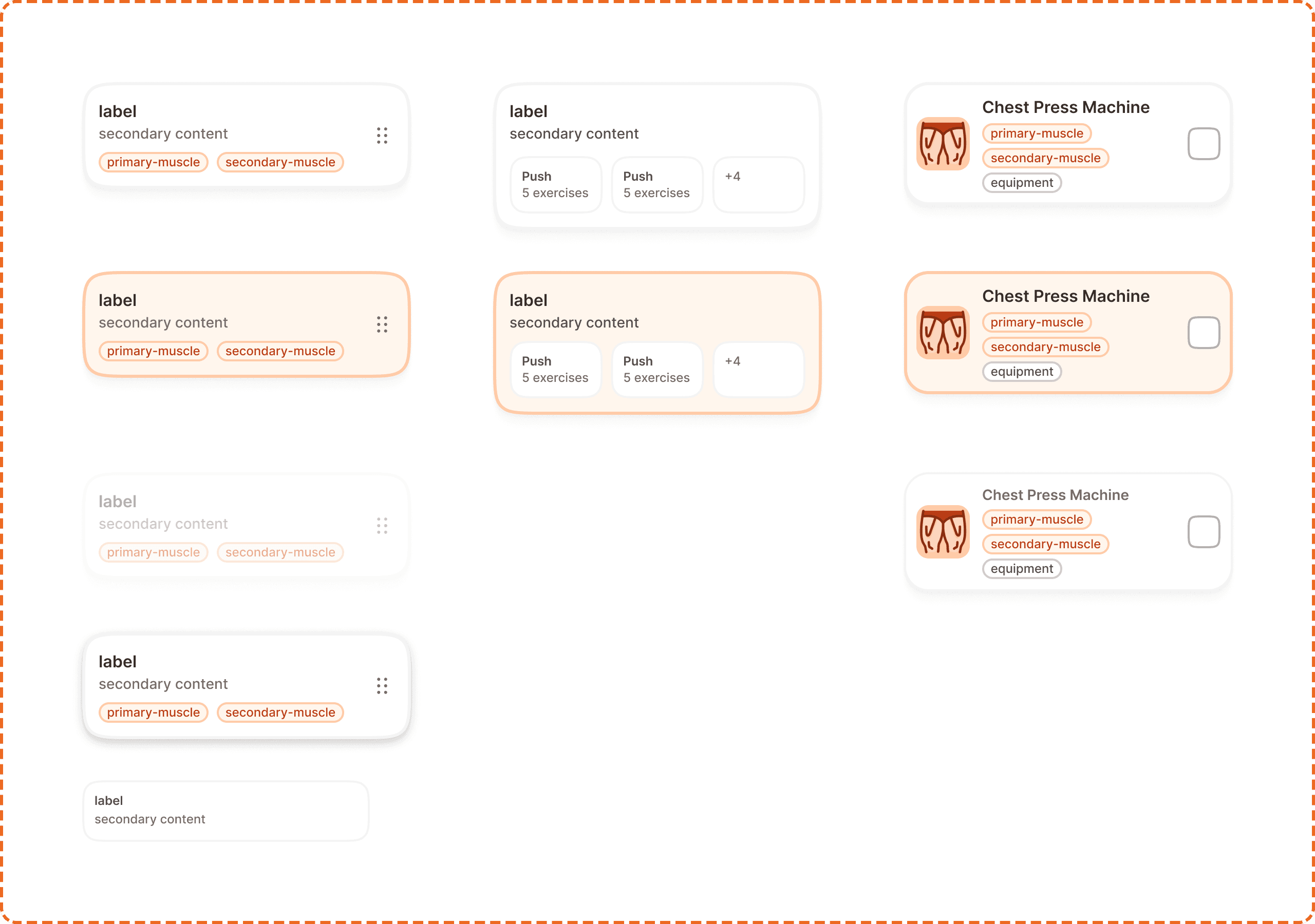
Template
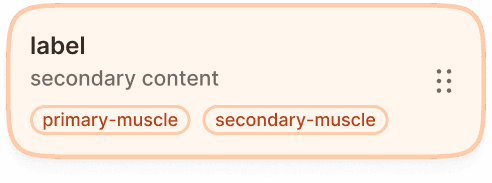
Displays a workout template with its name (label), description (secondary content), and target muscle group badges (primary-muscle, secondary-muscle). A drag handle (6 dot grid icon) sits on the right side, indicating the card can be reordered in the list.
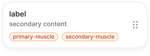
Program
Displays a training program with its name (label), description (secondary content), and a horizontal row of exercise chips. Each chip shows a workout name and its exercise count (e.g., "Push, 5 exercises"). When there are more workouts than can fit, a "+N" overflow count appears at the end.
Exercise
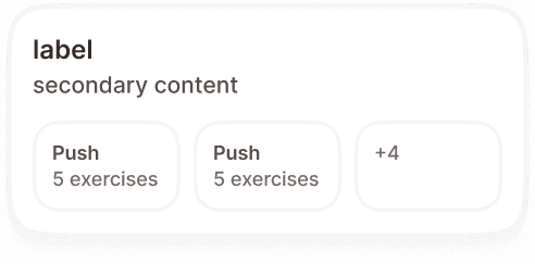
Displays a single exercise with a thumbnail image on the left, the exercise name ("Chest Press Machine") on the right, muscle group badges (primary-muscle, secondary-muscle, equipment) below the name, and a checkbox on the far right for selection.
The exercise card is used when browsing or selecting exercises to add to a workout template or program.
History
Displays a completed workout session as a read only record. A date header sits at the top, followed by a divider, then the session name (label) and a volume summary (secondary content) such as "6 exercises, 24 sets", with the muscle groups trained shown as badges below.
The history card is used in the history or activity log, where users review sessions they have already finished. It is not selectable or reorderable.

State
Each card type supports multiple interaction states via the state property.
Default
The resting state. The card displays its content at full opacity with no visual emphasis. Ready for interaction.
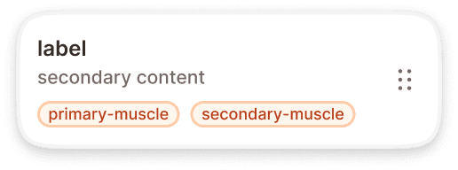
Pressed
The card is being tapped or clicked. An orange border appears around the card to give immediate visual feedback, confirming the touch was registered. The border uses the brand interactive color.
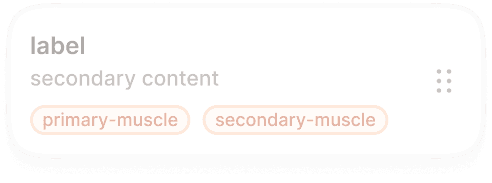
Disabled
The card is visible but non interactive. The entire card reduces to low opacity (40%, matching the system opacity/disabled token). Used when a card is temporarily unavailable, for example a locked template or an exercise that cannot be selected in the current context.
Dragged
Exclusive to the template type. When the user long presses and drags a card to reorder it, the card elevates with a shadow, shifts to a warm orange tint background, and the content becomes slightly more prominent. This state makes it visually clear which card is being moved.
Inside program
Exclusive to the template type. A compact variant (280x60px) showing only the label and secondary content, without muscle badges or drag handle. Used when a template card is nested inside a program card as one of its contained workouts.
Superset support
The workout card has a superset-on? property (yes/no) that controls whether superset indicators are visible. When superset mode is active, exercise cards display visual connectors linking paired exercises, indicating they should be performed back to back without rest.
Stucture
Template card (320x148px default)
A white card with rounded corners containing:
Label (bold text, top left) showing the workout template name.
Secondary content (muted text, below label) showing a brief description.
Muscle badges (bottom area) showing primary-muscle and secondary-muscle as outlined badge components. These use the brand orange tint for primary muscles and neutral styling for secondary.
Drag handle (right side, vertically centered) a 6 dot grid icon indicating the card is reorderable via long press and drag.
Program card (320x144px default)
Similar header structure to template, with:
Label and secondary content in the same position.
Exercise chips (bottom area) a horizontal row of compact chips, each showing a workout name and exercise count. When the list overflows, a "+N" count appears.
Exercise card (320x120px default)
A horizontal layout with:
Thumbnail image (left side) a small square image of the exercise.
Exercise name (bold text, right of thumbnail) the common gym name of the exercise.
Badges (below name) primary-muscle, secondary-muscle, and equipment badges stacked vertically.
Checkbox (far right, vertically centered) for selecting/deselecting the exercise.
Placement
Workout cards appear in vertical scrolling lists with consistent spacing between each card. Each card spans the full available width minus the page margins.
Stack workout cards vertically with a consistent gap (gap/md or gap/lg) between them.
Don't mix card types in the same list without a clear section divider. Templates, programs, and exercises should be grouped under their own headings.
When cards are reorderable (template cards with drag handles), the list should provide clear visual feedback during reordering: the dragged card elevates, the insertion point is indicated, and other cards shift to make room.
Don't mix card types in the same list without a clear section divider. Templates, programs, exercises, and history should be grouped under their own headings.
History cards are listed in reverse chronological order, most recent first, and can be grouped under date or month headings.
Accessibility
Touch target. All card types exceed the 44px minimum height (template 148px, program 144px, exercise 120px). The checkbox on exercise cards meets the 44x44px minimum touch target.
Drag and drop. Reordering via long press + drag must have a keyboard alternative. Provide move up/move down actions accessible via a context menu or keyboard shortcuts.
Focus indicator. Cards show a visible focus ring when navigated via keyboard, using the brand focus ring token (focus/brand).
Color independence. Muscle group badges use text labels plus colored fills. The pressed state uses both an orange border and a visible color change. The disabled state reduces opacity, which is perceivable regardless of color vision.
Content
Template labels should be the workout name the user created: "Push Day", "Upper Body Strength", "Full Body Friday". These are user generated and can be any length, but the card truncates with an ellipsis after 2 lines.
Secondary content should describe the workout briefly: "Chest, shoulders, and triceps" or "6 exercises, 45 min estimated". One line, truncated with ellipsis.
Exercise names should use the common gym name: "Chest Press Machine", "Barbell Bench Press", "Lat Pulldown". Not the anatomical name.
Muscle badges should be 1 to 2 words: "Chest", "Upper body", "Free weights", "Machine".
Program exercise chips should show the workout name and count: "Push, 5 exercises". The overflow count uses the "+N" format.
History dates should use a short, unambiguous format: "Jun 3, 2026". Avoid relative only labels like "Yesterday" without the actual date attached.
History summaries should state the session volume in a consistent order: "6 exercises, 24 sets".
Best practices
The drag handle on template cards is the only drag affordance. Users should not be able to drag from any other part of the card. Tapping the card body navigates to the template detail.
The checkbox on exercise cards should be the only selection trigger. Tapping the rest of the card should navigate to the exercise detail, not toggle selection.
The inside-program variant should only be used when rendering a template card as a child of a program card. Never use it as a standalone card in a list.
When a card is disabled, consider showing a tooltip or contextual message explaining why it is not available (e.g., "Complete onboarding to unlock this template").
The dragged state should feel elevated and distinct from the rest of the list. Use the warm orange tint background and a visible shadow to make the dragged card stand out clearly against the white card backgrounds below it.
History cards are a read only record of a completed session. Tapping a history card opens the full session summary. It never enters an edit mode and never shows a drag handle or checkbox.
