Exercise table
An exercise table is the expanded view of a single exercise during workout creation or an active workout session. It displays the exercise header (name, muscle tags, equipment) and a set table where users define or log their sets. This is the component users interact with the most during their entire Muba experience.
The exercise table adapts its layout and interaction model depending on the context: in editing mode (building a workout template), users define set targets with type, reps, and rest. In workout mode, users log actual weight and reps for each set and mark them complete. This dual nature makes the exercise table the most complex component in the entire design system.
When to use
Use an exercise table:
Inside a workout template builder to define the set structure for each exercise (type, target reps, rest time).
During an active workout session to log actual performance (weight, reps) and mark sets as complete.
Anywhere the user needs to see and interact with the full set breakdown of an exercise.
Don't use an exercise table:
For browsing or selecting exercises. Use the workout card (exercise type) instead.
For displaying exercise history or progress. Use the chart component instead.
For a read only summary of a completed workout. Use a simplified list view instead.
Types
The exercise table has 3 main variants controlled by the variant property.
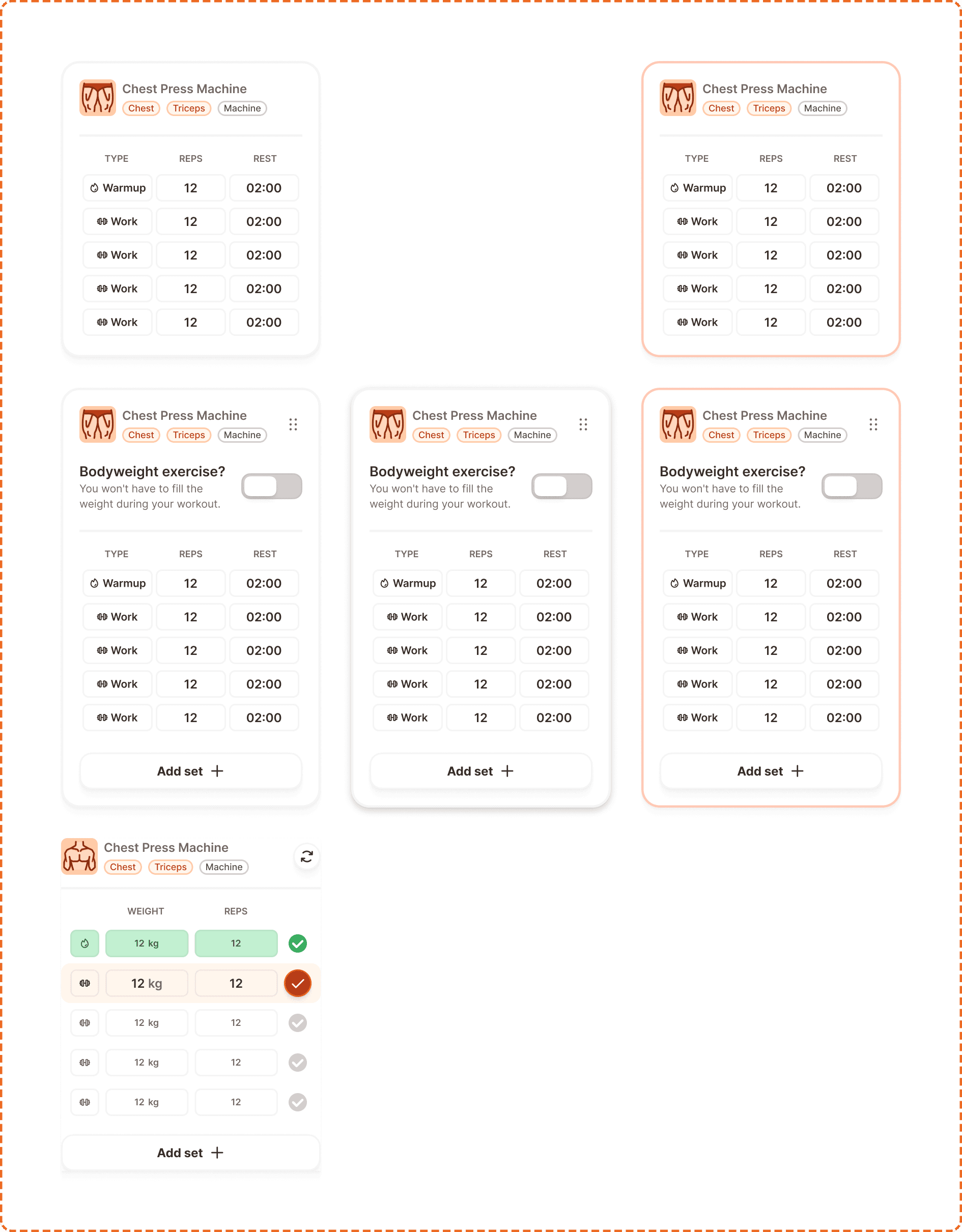
Default
The read only view. Shows the exercise header (name, muscle tags) and the set table with columns for TYPE, REPS, and REST. No editing controls are visible. Used when viewing a saved template without editing it.
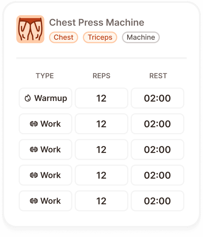
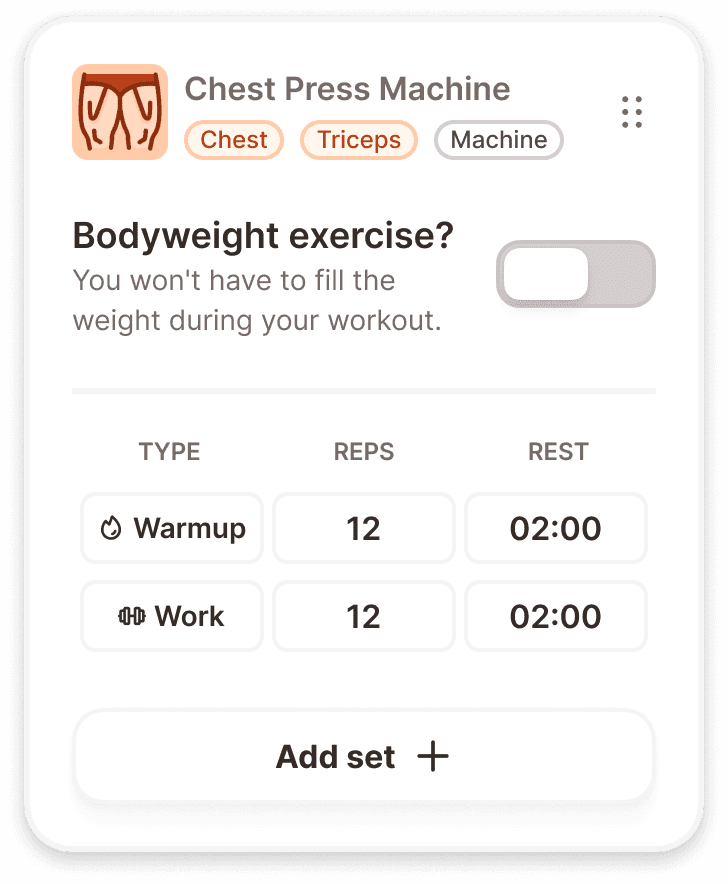
Editing
The template building view. Shows the same header as default plus a "Bodyweight exercise?" toggle with helper text ("You won't have to fill the weight during your workout."), the set table with editable cells, and an "Add set +" button at the bottom. A more options icon (three dots) appears in the header for accessing additional actions. Muscle tags use the brand orange tint when in editing mode.
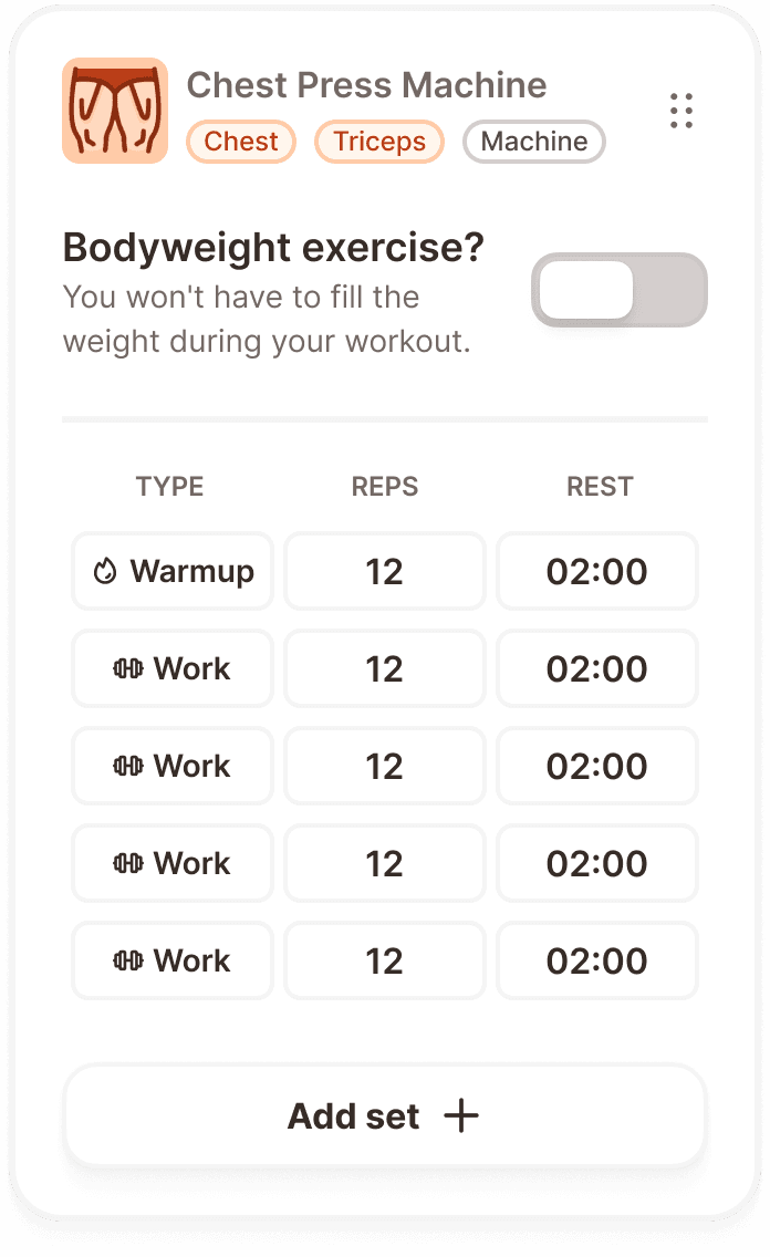
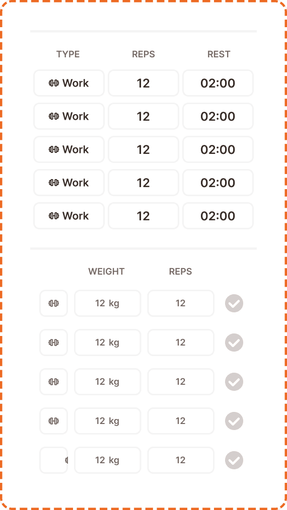
In workout
The active session view. The header shows the exercise name, muscle tags, and a superset toggle icon. The set table switches to WEIGHT and REPS columns with a completion checkmark on each row. The current set row is highlighted with the brand orange fill. Completed sets show a green success state. Upcoming sets are disabled.
State
Each card type supports multiple interaction states via the state property.
Default
The standard resting state. The card displays its content at full opacity.
Dragged
Exclusive to the editing variant. When the user long presses and drags the exercise card to reorder it within the template, the card elevates with a shadow and shifts to a warm orange tint background (same dragged treatment as the workout card component).
Inside program
Available in both default and editing variants. When superset mode is active, the card's header border turns orange and a superset locker connector appears between paired exercise cards.
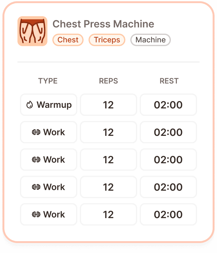
Exercise header
The top section of every exercise table variant. It contains:
Exercise image (left side) a small thumbnail of the exercise.
Exercise name ("Chest Press Machine") in bold text next to the image.
Muscle tags below the name as badge components: primary muscle, secondary muscle, equipment type. In default/superset states these use neutral styling. In editing and superset states they use the brand orange tint.
More options (three dots icon, editing variant only) in the top right corner for accessing delete, duplicate, and other actions.
Superset toggle (in-workout variant) a link chain icon in the top right corner.
Master table
The set table is the core data area of the exercise card. It has 2 types matching the parent variant context.
Default/editing table
Columns: TYPE, REPS, REST.
Each row represents one set in the template definition. The TYPE column shows the set type (Work, Warmup, Cool, Rest, Failure). The REPS column shows the target rep count or rep range (e.g., "12" or "12-16"). The REST column shows the rest duration (e.g., "02:00").
In workout table
Columns: (type icon), WEIGHT, REPS, (completion checkmark).
Each row represents one set during the active session. The type icon column shows the set type. The WEIGHT column is an editable field showing the weight used (e.g., "12 kg"). The REPS column is an editable field showing the actual reps performed. The checkmark column is a completion indicator.
Both tables end with an "Add set +" row that appends a new set to the bottom.
Master exo card item
Each row in the set table is an instance of the master exo card item component. It has two variant groups matching the table context.
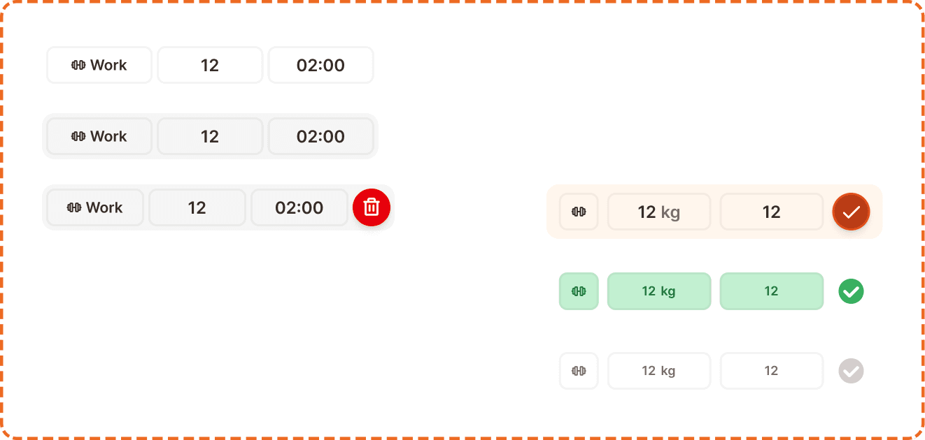
Editing variant
Default is the resting state. The row shows type, reps, and rest cells ready for editing.
Pressed gives immediate visual feedback. The row darkens slightly.
Delete show reveals a red delete button on the right side of the row, triggered by swiping left. Tapping the delete button removes the set.
In workout variant
Current is the active set being performed. The row highlights with the brand orange fill on the weight and reps cells. The checkmark shows as a large filled orange circle, indicating this is the set the user should log now.
Success indicates a completed set. The cells show a green success tint and the checkmark turns green with a check icon inside.
Disabled is an upcoming set that has not been reached yet. The cells and checkmark appear at reduced opacity. The user cannot interact with these rows until previous sets are completed.
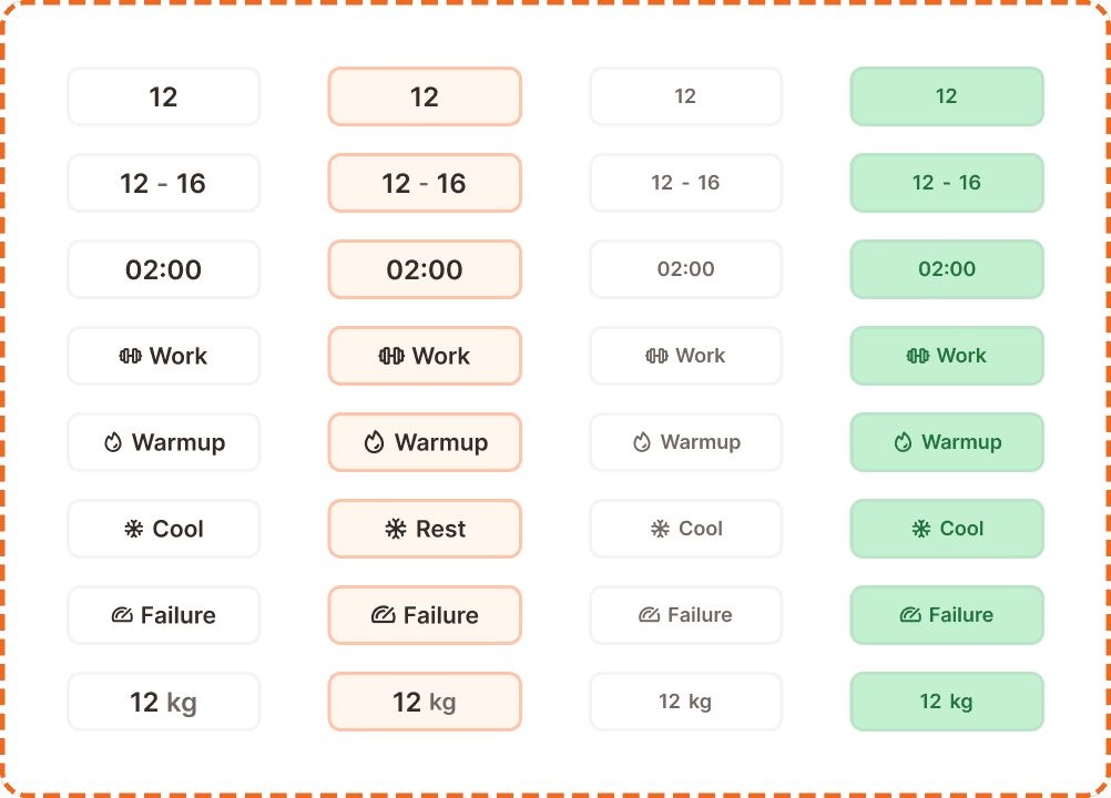
Cell
Each cell in a set row is an instance of the master card exo item component. It is a compact 117x36px element that supports multiple data types.
Cell properties
range? (yes/no) controls whether the reps cell shows a single value ("12") or a range ("12-16"). Only applicable to the reps variant.
active? (yes/no) controls whether the cell is in its active/editing state with bold text and a stronger border.
disabled? (yes/no) reduces the cell to low opacity for upcoming sets in the in workout table.
success? (yes/no) applies a green success tint to the cell for completed sets.
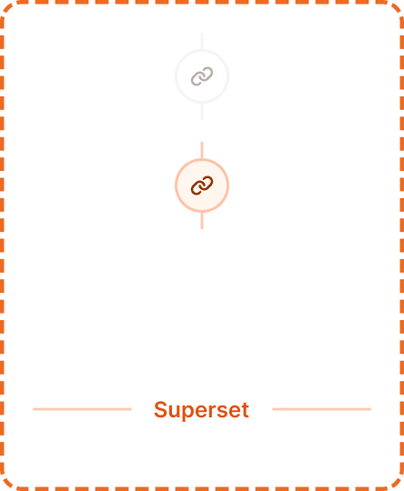
Superset locker
The superset locker is a visual connector that sits between two paired exercise cards, indicating they form a superset (performed back to back without rest).
States
Inactive (active?=no, hidden?=no) shows a gray chain link icon on a white circle background. The superset is available but not activated.
Active (active?=yes, hidden?=no) shows an orange chain link icon on a peach circle background. The two exercises are linked as a superset.
Hidden (active?=no, hidden?=yes) the locker is not visible. Used when the exercises are not adjacent or superset mode is off.
In workout (active?=in-workout, hidden?=no) shows the locker with a "Superset" text label below it, providing extra clarity during the active session.
Interaction
Editing mode
Tapping a cell opens the numeric keyboard (for reps, timer, weight) or a type picker (for set type).
Swiping left on a set row reveals the delete button.
Tapping "Add set +" appends a new row with default values.
Long pressing and dragging the card reorders it within the template.
The bodyweight toggle immediately updates the set table structure.
In workout mode
Only the current set row (orange highlighted) is fully interactive.
Tapping the weight or reps cell on the current row opens the numeric keyboard.
Tapping the checkmark on the current row marks the set as complete (transitions to success state), automatically advances to the next set, and may trigger the rest timer.
Completed sets (green) are read only. They can be tapped to edit, but this requires explicit confirmation to avoid accidental changes.
Upcoming sets (disabled) cannot be interacted with until previous sets are completed.
Placement
Exercise tables stack vertically inside a workout template builder or active workout session. Each exercise occupies the full width of the content area.
When superset mode is active, paired exercises sit adjacent to each other with the superset locker connector between them.
The "Add set +" row is always the last element inside each exercise table. It should not be confused with the "Add exercise" action in the footer, which adds a new exercise to the workout.
Accessibility
Touch target. Each cell is 117x36px, which is below the 44px minimum height. However, the full set row height (44px in editing, 52px in workout) meets the minimum. Individual cell tapping is aided by the row acting as a single interactive zone that directs focus to the tapped cell.
Keyboard. Tab moves between cells within a row. Enter confirms a cell value and moves to the next cell. Arrow keys navigate between rows.
Screen reader. Announces the exercise name, set number, and cell values: "Set 3 of 5, type: work, reps: 12, rest: 2 minutes." In workout mode: "Set 2 of 5, current set, weight: 12 kilograms, reps: 12, not completed."
Color independence. The current set uses both the orange fill and position (it is always the topmost non completed row). Success sets use both green fill and a checkmark icon. Disabled sets use both reduced opacity and position (below the current set). Set types use both icons and text labels ("Work", "Warmup", "Failure").
Swipe to delete. The swipe left gesture to reveal the delete button must have an alternative. A long press context menu or an explicit delete option in the row's more menu should be available for users who cannot perform swipe gestures.
Content
Set type labels should be short and universally understood: "Work", "Warmup", "Cool", "Rest", "Failure". Each type has a dedicated icon reinforcing its meaning.
Column headers use abbreviated uppercase labels: "TYPE", "REPS", "REST" for editing mode; "WEIGHT", "REPS" for in workout mode.
Weight values include the unit suffix: "12 kg" or "12 lbs" depending on the user's preference.
Rest values use the mm:ss format: "02:00", "01:30".
Rep ranges use a single value ("12") or a hyphenated range ("12-16") depending on the range? property.
Placement
The in workout table should always pre populate with the values from the template. If the template says "12 reps at Work type", the in workout row should show "12" in the reps field and the user only needs to enter the weight and tap the checkmark.
The current set should always be the topmost incomplete set. Never highlight a set out of order.
When all sets are completed (all green), show a completion state and auto advance to the next exercise or trigger a summary.
The "Add set +" action during an active workout should be used sparingly. Most users follow the template. But the option must exist for users who want to do extra sets.
Swipe to delete should require a confirmation (the delete button appears but must be tapped). Do not delete on swipe alone.
The bodyweight toggle should be set during template creation. Changing it during an active workout should be possible but should prompt confirmation since it affects the table structure.
