Toggle
A toggle (switch) lets users turn a single setting on or off. Unlike checkboxes which batch changes for later submission, toggles apply their change immediately when flipped. Each toggle includes a label, an optional help button, and an optional description.
In Muba, toggles control instant settings such as enabling rest timer auto start, turning notifications on or off, switching between kg and lbs, or marking an exercise as bodyweight. The on state uses the brand brown/orange track with a checkmark inside the thumb to provide clear confirmation that the setting is active.
When to use
Use a toggle:
For binary settings that take effect immediately without requiring a save action.
When the on/off states clearly map to "enabled" and "disabled" for a specific feature or preference.
In settings screens, preference panels, and inline feature switches.
Don't use a toggle:
For selections that are saved as part of a form submission. Use a checkbox instead, since checkboxes imply "this will be saved when I submit."
For mutually exclusive choices between two or more named options. Use radio buttons instead.
For agreeing to terms or opting in to something. Use a checkbox, which better communicates a deliberate opt in action.
Selection modes
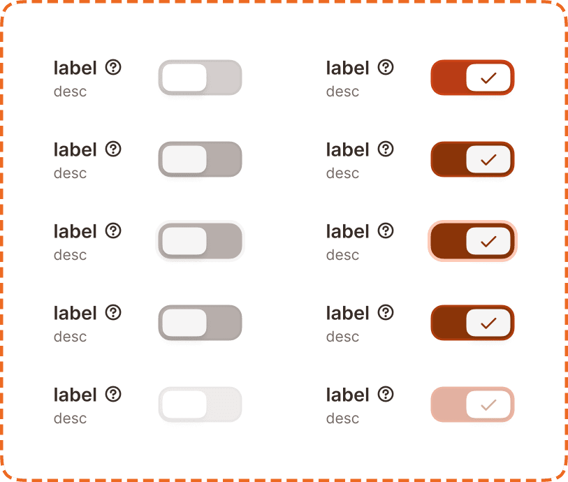
The toggle supports two visual modes.
Off
The default/inactive mode. The track appears in a muted gray color with a white thumb positioned on the left side. The setting is not active.
On
The active mode. The track fills with the brand brown/orange color and the thumb slides to the right, displaying a white checkmark icon inside it. This double signal (color change plus checkmark) confirms that the setting is enabled, even for users who cannot perceive color.
Structure
Each toggle instance is composed of
Label sits to the left of the toggle control. It describes the setting in bold text.
Help button (optional) appears to the right of the label as a "?" icon. It triggers a tooltip explaining what the setting does (see Help Button component).
Description (optional) sits below the label in smaller, muted text. It provides additional context about the effect of enabling or disabling the setting.
Toggle control is a pill shaped track with a circular thumb, positioned to the right of the label/description block.
This structure mirrors the checkbox and radio components. The differentiator is the pill shaped track and the sliding thumb animation, which signal "instant effect" rather than "saved later."
Interaction
Each mode (off, on) supports 5 interaction states:
Default is the resting state. The toggle is visible and ready for interaction.
Hovered provides a subtle visual shift on desktop when the cursor is over the component. The track and thumb darken slightly.
Pressed gives immediate visual feedback during a tap or click. The thumb may compress or the track may darken further.
Focused displays a visible orange focus ring around the toggle control for keyboard and assistive technology navigation.
Disabled reduces the entire component (label, description, and toggle) to low opacity. No interaction is possible. The toggle retains its current mode (on or off) visually but cannot be changed.
Toggle behavior
Tapping the toggle or its label switches between off and on immediately.
The thumb slides smoothly from left to right (off to on) or right to left (on to off) with a short animation.
The entire row (label + description + toggle control) is tappable, not just the track.
The change takes effect immediately. There is no "save" step.
Placement
Toggles appear in vertical lists with consistent spacing between each setting. Each toggle occupies a full width row to maximize the tappable area.
Stack toggles vertically with equal spacing between settings.
Don't place toggles in a horizontal row. The label and track need horizontal space to remain readable.
Group related toggles under a section heading (e.g., "Notifications", "Workout preferences") to help users scan long settings screens.
Accessibility
Touch target. Each toggle row is at least 46px tall. The entire row (label + description + control) is tappable, providing a generous touch area that exceeds the 44px minimum.
Focus indicator. The focused state displays an orange outline around the toggle control, meeting the 3:1 contrast ratio for non text elements.
Color independence. The on state uses three simultaneous signals: the track color changes to brown/orange, the thumb slides to the right, and a checkmark icon appears inside the thumb. Even in grayscale or for users with color vision deficiency, the position change and checkmark make the state unambiguous.
Content
Toggle label copy should:
Describe the setting as a positive statement: "Auto start rest timer", "Show weight in kilograms", "Bodyweight exercise."
Use sentence case.
Be 1 to 6 words. Toggles need more descriptive labels than checkboxes because the on/off meaning must be self evident from the label alone.
Avoid negatives. "Enable notifications" is clearer than "Disable notification sounds." The off state already implies disabled.
Description copy should:
Explain the effect of enabling the setting: "The rest timer will start automatically after you log a set."
Be one sentence maximum.
Only include a description if the label alone is not self explanatory.
"Auto start rest timer" with description "Timer begins automatically when you complete a set" is good. Clear label, useful description.
"Rest timer auto" is bad. Ambiguous abbreviation, unclear what happens when it is on versus off.
"Don't show rest timer" is bad. Negative phrasing makes the on/off logic confusing (does "on" mean the timer is hidden?).
Best practices
Toggles imply instant effect. If the change requires a save action, use a checkbox instead. Users expect that flipping a toggle changes something right away.
Default to the off state unless there is a strong user benefit to having the setting enabled by default. Be transparent about what you enable for the user without their explicit choice.
The checkmark inside the on state thumb is a deliberate accessibility decision. Do not remove it. It ensures the state is communicable without relying on color or position alone.
When a toggle controls a destructive or high consequence setting (like deleting workout data or making a profile public), pair it with a confirmation dialog before applying the change. The toggle still flips immediately, but the action is confirmed before executing.
Keep toggle groups to 8 or fewer items per section. For longer lists of settings, break them into multiple labeled sections.
