Radio button
A radio button allows users to select exactly one option from a set of mutually exclusive choices. Selecting a new option automatically deselects the previously selected one. Each radio includes a label, an optional help button, and an optional description.
In Muba, radio buttons are used for exclusive selections such as choosing a workout split type, selecting a unit system (kg vs lbs), picking a rest timer preset, or choosing between program difficulty levels. The radio control uses a circular shape with a dark brown filled inner dot when selected, visually distinguishing it from the rounded square checkbox.
When to use
Use a radio button:
When the user must choose exactly one option from a set of 2 to 5 mutually exclusive choices.
When all options need to be visible at once so the user can compare before choosing.
In settings or form flows where a single selection is saved as part of a submission (not applied instantly).
Don't use a radio button:
For non exclusive selections where multiple options can be active at the same time. Use checkboxes instead.
For instant on/off toggles that take effect immediately. Use a toggle switch instead.
For long lists of 6 or more options. Use a dropdown instead.
For binary yes/no choices that feel like a setting. Use a toggle instead.
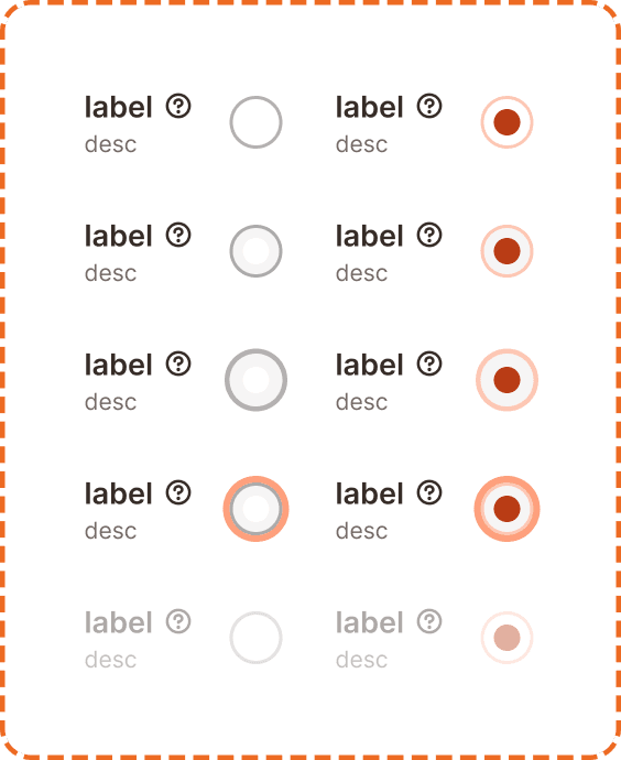
Selection modes
The radio supports two visual modes.
Unchecked
The default state. An empty circle with a light gray border. The option is not selected.
Checked
The option is selected. The circle fills with the brand brown color and displays a darker inner dot, creating a concentric ring effect.
Structure
Each radio instance is composed of
Label sits to the left of the radio control. It describes the option in bold text.
Help button (optional) appears to the right of the label as a "?" icon. It triggers a tooltip with additional context (see Help Button component).
Description (optional) sits below the label in smaller, muted text. It provides additional guidance about what the option means.
Radio control is a circle positioned to the right of the label/description block.
This structure mirrors the checkbox component exactly. The only visual difference is the control shape: circular for radio, rounded square for checkbox.
Interaction
Each selection mode (unchecked, checked) supports 5 interaction states:
Default is the resting state. The radio is visible and ready for interaction.
Hovered provides a subtle background shift on desktop when the cursor is over the component.
Pressed gives immediate visual feedback during a tap or click. The control darkens slightly.
Focused displays a visible orange focus ring around the radio control for keyboard and assistive technology navigation.
Disabled reduces the entire component (label, description, and control) to low opacity. No interaction is possible. The radio retains its current selection mode visually but cannot be changed.
Toggle behavior
Tapping an unchecked radio selects it and automatically deselects the previously selected radio in the same group.
Tapping an already checked radio does nothing. You cannot deselect a radio by tapping it again. One option in the group must always remain selected.
The entire row (label + description + control) is tappable, not just the circle itself.
Placement
Radio buttons appear in vertical lists with consistent spacing between each option. Each option occupies a full width row to maximize the tappable area.
Stack radio options vertically with equal spacing between them.
Don't place radios in a horizontal row on mobile. The touch targets become too small and the labels get truncated.
Always group radios under a visible group label or heading that describes what the user is choosing (e.g., "Unit system" above the kg/lbs options). The group label is separate from the individual radio labels.
Accessibility
Touch target. Each radio row is at least 46px tall. The entire row (label + description + control) is tappable, providing a generous touch area that exceeds the 44px minimum.
Invisible padding. The radio circle itself appears compact visually but uses invisible padding to expand its tappable area to at least 44x44px, consistent with the approach used in the checkbox and help button components.
Focus indicator. The focused state displays an orange outline around the radio control, meeting the 3:1 contrast ratio for non text elements.
Color independence. The checked state uses both a filled background and a visible inner dot. Selection is never communicated through color alone. The concentric ring pattern is recognizable even in grayscale.
Content
Radio label copy should:
Describe each option clearly in 1 to 5 words.
Use sentence case.
Be parallel in structure across the group. If one label is a noun ("Kilograms"), all labels should be nouns ("Pounds"), not a mix of nouns and sentences.
Be mutually exclusive. The user should never feel like two options could both apply.
Description copy should:
Add context only when the label alone is not self explanatory.
Be one sentence maximum.
Group label should describe the choice being made: "Unit system", "Rest timer", "Difficulty level".
"Kilograms" and "Pounds" under the group label "Unit system" is good. Clear, parallel, mutually exclusive.
"I want to use kilograms for my weights" and "Use pounds instead" is bad. Inconsistent structure, first person pronouns, unnecessarily long.
Best practices
Always provide a default selection in a radio group unless there is a strong reason to force the user to make a deliberate choice. Having no default selection adds unnecessary friction.
Keep radio groups to 5 options or fewer. For longer lists, switch to a dropdown.
Never use a single radio button on its own. Radios only make sense in groups of 2 or more.
Radio groups and checkbox groups share the same visual structure (label + help + desc + control). The only visual differentiator is the shape of the control. Be consistent so users learn to associate circles with "pick one" and rounded squares with "pick many."
If the selection needs to take effect immediately (like switching a unit system live), consider using a segmented control instead. Radios imply the choice is saved later as part of a form.
