Checkbox
A checkbox allows users to select one or more options from a set of choices, toggling between checked and unchecked states. It supports an indeterminate state for partial selections within a group. Each checkbox includes a label, an optional help button, and an optional description.
In Muba, checkboxes appear in settings, preferences, and multi select contexts such as selecting muscle groups for a filter, toggling workout options, or accepting terms during onboarding. The checkbox control uses a rounded square that fills with the brand brown color and displays a checkmark when selected.
When to use
Use a checkbox:
When the user can select one or more options from a set of non exclusive choices.
For binary opt in fields like "Remember me" or "I accept the terms."
When selections are not applied immediately but are saved as part of a form or settings flow.
Don't use a checkbox:
For mutually exclusive choices where only one option can be selected. Use radio buttons instead.
For instant on/off toggles that take effect immediately without saving. Use a toggle switch instead.
For selecting from a very long list of options. Use a dropdown with multi select instead.
Selection modes
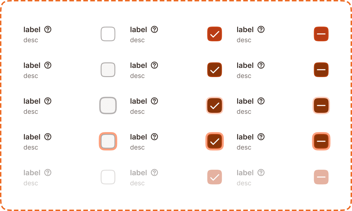
The checkbox supports three visual modes that communicate different selection states.
Unchecked
The default state. An empty rounded square with a light border. The option is not selected.
Checked
The option is selected. The rounded square fills with the brand brown color and displays a white checkmark icon.
Indeterminate
Used in group contexts where some but not all child checkboxes are selected. The rounded square fills with the brand brown color and displays a white minus icon instead of a checkmark. This state is only set programmatically (a parent checkbox reflecting partial child selection) and cannot be toggled to directly by the user.
Structure
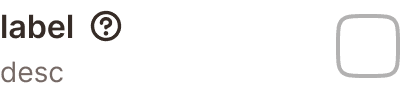
Each checkbox instance is composed of
Label sits to the left of the checkbox control. It describes the option in bold text.
Help button (optional) appears to the right of the label as a "?" icon. It triggers a tooltip with additional context (see Help Button component).
Description (optional) sits below the label in smaller, muted text. It provides additional guidance about what the option does.
Checkbox control is a rounded square positioned to the right of the label/description block.
Interaction
Each selection mode (unchecked, checked, indeterminate) supports 5 interaction states:
Default is the resting state. The checkbox is visible and ready for interaction.
Hovered provides a subtle background shift on desktop when the cursor is over the component.
Pressed gives immediate visual feedback during a tap or click. The control darkens or scales slightly.
Focused displays a visible orange focus ring around the checkbox control for keyboard and assistive technology navigation.
Disabled reduces the entire component (label, description, and control) to low opacity. No interaction is possible. The checkbox retains its current selection mode (unchecked, checked, or indeterminate) visually but cannot be changed.
Toggle behavior
Tapping the checkbox or its label toggles between unchecked and checked.
If the checkbox is indeterminate, tapping it moves it to checked (not unchecked).
The entire row (label + description + control) is tappable, not just the square itself.
Placement
Checkboxes appear in vertical lists with consistent spacing between each option. Each option occupies a full width row to maximize the tappable area.
Stack checkboxes vertically with equal spacing between options.
Don't place checkboxes in a horizontal row on mobile. The touch targets become too small and the labels get truncated.
When using checkbox groups with an "All" parent checkbox, place the parent above the children with a visual indent to communicate the hierarchy. The parent uses the indeterminate state when some but not all children are selected.
Accessibility
Touch target. Each checkbox row is at least 46px tall. The entire row (label + description + control) is tappable, providing a generous touch area that exceeds the 44px minimum.
Invisible padding. The checkbox control itself appears compact visually but uses invisible padding to expand its tappable area to at least 44x44px, consistent with the approach used in the help button component.
Focus indicator. The focused state displays an orange outline around the checkbox control, meeting the 3:1 contrast ratio for non text elements.
Color independence. The checked state uses both a filled background and a checkmark icon. The indeterminate state uses a filled background and a minus icon. Selection is never communicated through color alone.
Content
Checkbox label copy should:
Describe the option clearly in 1 to 5 words.
Use sentence case.
Be a noun phrase or short statement, not a question ("Upper body" not "Do you want upper body?").
Be scannable. In a list of checkboxes, users read labels vertically. Keep them short and parallel in structure.
Description copy should:
Add context only when the label alone is not self explanatory.
Be one sentence maximum.
Use a muted tone. The description supports the label, it does not replace it.
"Chest" with description "Includes pecs and front delts" is good. Clear, scannable, helpful context.
"Do you want to include chest exercises in your workout plan?" is bad. Too long, phrased as a question, not scannable in a list.
Best practices
Always pair checkboxes with visible labels. A standalone checkbox square without a label is not accessible.
Use the indeterminate state only for parent checkboxes in a hierarchical group. Never use it for standalone checkboxes.
Keep checkbox groups to 7 options or fewer. For longer lists, use a dropdown or a search and filter pattern instead.
Don't pre check options unless there is a strong default that benefits the user. Pre checking options to increase opt in rates is a dark pattern.
When a checkbox controls something irreversible (like deleting data), pair it with a confirmation step rather than relying on the checkbox alone.
