Button
A button lets the user perform an action with a tap or a click. It is the most fundamental interactive element in Muba, from starting a workout to saving a set to confirming a PR.
In a gym context, buttons need to be large enough for sweaty hands, fast enough to tap between sets, and clear enough to read at a glance under harsh overhead lighting. Every button in the system follows strict hierarchy rules so users always know which action matters most.
When to use
Use a button:
When the user needs to perform an action, like starting a workout, saving data, or confirming something.
When you need to give emphasis to an action that moves the user forward in a flow.
Don't use a button:
When you want to link to other pages or external resources. Use a link instead.
For hierarchical navigation where the user goes deeper into the app. Use a navigation option instead.
For quick contextual actions on content items. Use an action button instead.
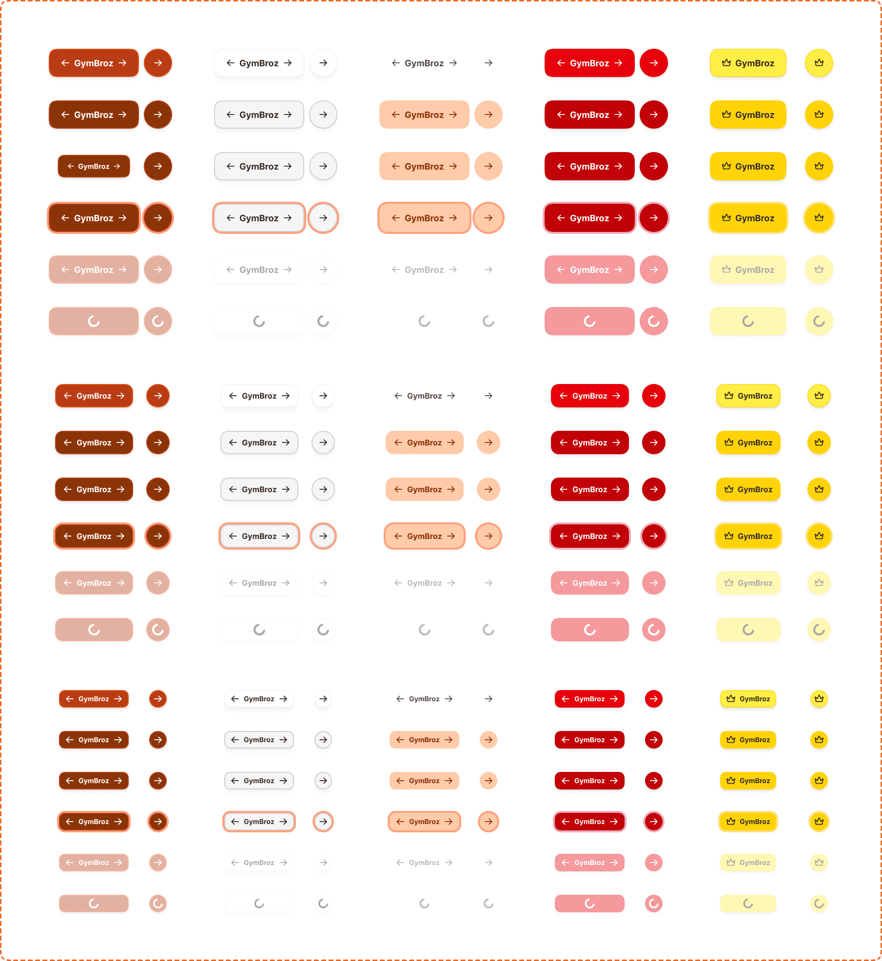
Hierarchy
Hierarchy sets a visual ranking among the buttons displayed on the screen to help the most important buttons take precedence over others. Buttons support 5 different hierarchy levels.
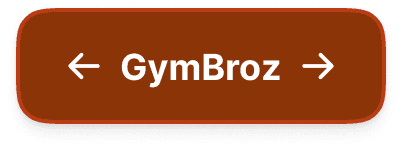
Primary
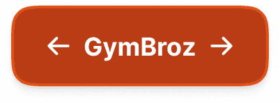
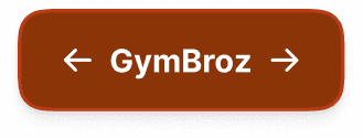
The most important action to move forward in a flow, acknowledge and dismiss, or finish a task. The primary button uses a dark filled background (chocolate brown) to stand out as the dominant action on the screen.
You should always have one primary button per screen where relevant. This can contextually change if another action needs to be completed before being able to proceed.
Use one primary button per page to indicate the most important action.
Don't use multiple primary buttons on a page.
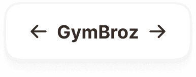
Secondary
Use secondary for providing alternatives to the primary action, or when none of your actions are more important than the others. The secondary button uses an outlined style with no fill.
Use secondary buttons when you need to display multiple key actions at the same level of hierarchy.
Don't pair a secondary with a destructive action. Use tertiary instead.
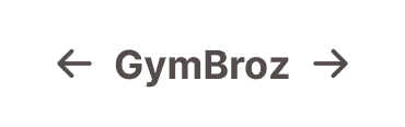
Tertiary
Dismissive actions give users a way out of something, letting them cancel, do nothing, dismiss, or skip. Tertiary buttons use a subtle, low-emphasis style with no border and a transparent or very light background.
Use tertiary for low-priority actions like "Skip" or "Cancel".
Don't use tertiary as the only action on a screen. It needs a primary or secondary to anchor the hierarchy.
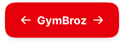
Destructive
Use destructive for confirming actions that cannot be easily undone, like deleting a workout, removing an exercise from a program, or canceling a subscription. The destructive button uses a red/crimson fill to signal danger.
Use destructive only for irreversible or high-consequence actions.
Don't pair destructive with secondary. Use tertiary as the dismissive option instead.
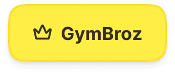
Upgrade
The upgrade button is a special hierarchy used exclusively for actions that lead to a premium subscription or paid feature. It uses a golden/amber fill with a crown icon to visually distinguish it from all other buttons and signal premium value.
Use upgrade only for actions that directly lead to a subscription or premium feature (e.g., "Go Premium", "Unlock").
Don't use upgrade for general actions, even if they relate to paid features indirectly.
Sizes
There are three button sizes, each designed for different contexts.
Large (58px)
The large button is used to move users forward in a flow. It is full-width on mobile and auto-width on desktop.
Use large buttons at the bottom of the page or content to guide the user to the next step.
Don't use large buttons inside cards or list items.
Medium (48px)
The medium button is used for inline content that needs greater emphasis than small. It supports icon left/right and wraps to content width.
Use medium inline with other buttons at the same size.
Don't use medium inside list items.
Small (36px)
The small button is used for smaller inline content such as list items and compact UI. It supports icon left/right and wraps to content.
Use small where you need more horizontal space or inside tighter layouts.
Don't use small in place of large buttons or at full width.
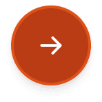
Icon-only
Every hierarchy and size supports an icon-only variant, where the button displays only an icon with no label. Icon-only buttons maintain the same height as their labeled counterparts (lg: 58px, md: 48px, sm: 36px) but use a square aspect ratio.
Use icon-only buttons when the icon is universally recognizable (arrow, close, add, delete).
Don't use icon-only for actions where the meaning is ambiguous without a label. Add a label instead.
Always provide an accessible label via aria-label for screen readers, since there is no visible text.
Accessories
Icons
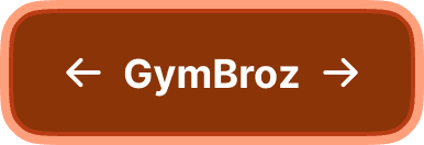
Use icon right for forward actions (arrows, send).
Use icon left to support the message (add, edit, back).
Use icons that best match the written content.
Don't use icons for the sake of it.
Don't place action icons on the left or supporting icons on the right.
Interaction
Unless the button is disabled, the user can tap or click on it to perform the action assigned to it. All hierarchy levels support the same 6 interaction states.
Default
Is the resting state, ready for interaction.
Hovered
Provides a subtle visual shift when the cursor is over the button on desktop. The fill color darkens slightly.
Pressed
Gives immediate feedback during a tap or click. The button darkens further and may scale down slightly.
Focused
Displays a visible focus ring for keyboard and assistive technology navigation. The focus ring appears as an offset outline around the button.
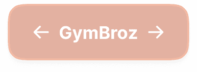
Disabled
Reduces the button to a low-opacity appearance with no pointer events. Consider providing alternative cues explaining why a button is disabled, or rethink the design so buttons are always enabled but validate before proceeding.
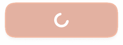
Loading
Replaces the label with a spinner to indicate an action is in progress. The button remains visible but prevents double-tapping. Icon-only buttons show a smaller spinner at the same dimensions.
Placement
The button should always be contextual, used inline with the content it relates to. This creates cohesion between the context and the action.
On mobile, if an action must be taken by the user to finalize or proceed, pin it to the bottom of the screen outside the scrolling area. Pin only one primary action per screen.
Use buttons inline with the content they relate to.
Don't float buttons disconnected from their context.
Accessibility
Touch target. All button sizes meet or exceed the 44x44px minimum. Large (58px) and medium (48px) are well above the threshold. Small (36px) should use padding to extend the tappable area to at least 44px in gym-context flows where motor precision drops.
Dynamic sizing. Button height may change based on the user's system-wide preferred font size. Text wraps to accommodate larger sizes. Never truncate button text.
Focus indicator. A visible focus ring appears around the button following the system focus token specification.
Disabled states. Consider providing alternative cues explaining why a button is disabled, ensuring screen readers can convey this information, or rethink the design so that buttons are always enabled but provide feedback on required steps before proceeding.
Content
Button copy should:
Start with a verb, like "Save" or "Start".
Be just a few words (ideally 1 or 2).
Describe the action. If someone only reads the button, they should know what happens next.
Connect to the content around it. For example, use the same words as the title.
Avoid first-person pronouns like "me", "my", and "I".
Be in sentence case (only capitalize the first letter).
Have no full stop.
"Log in" is good. Clear verb, describes exactly what happens.
"I want to log in to my account" is bad. Too long, uses first person, describes the interface not the action.
"Start workout" is good. Action verb, connected to context.
"Save changes" is good. Describes the outcome.
"Submit" should be avoided. Too generic. What are we submitting?
Upgrade button copy should emphasize value: "Go Premium", "Unlock", "Upgrade". Avoid generic CTAs like "Buy" or "Pay".
