Input and dropdown
An input allows users to enter and edit data through keyboard interaction. It is the primary form element in Muba, used for everything from typing exercise names and entering weight values to searching the exercise library and setting up an account.
The input system is built in layers. The parent input component wraps a label, description, field, and feedback message into a single form unit. Inside it, the field itself is one of several nested components (text field, dropdown, or mobile number) each with their own types and states. This layered architecture keeps the system flexible: you can swap the inner field without rebuilding the outer label and feedback structure.
When to use
Use an input:
Whenever the user needs to provide or edit data: text, numbers, passwords, search queries, phone numbers, or selections from a list.
In any form context where a label, optional description, and validation feedback are needed around the field.
Don't use an input:
For binary choices (yes/no, on/off). Use a toggle or checkbox instead.
For selecting from a short list of 2 to 4 visible options. Use radio buttons or a segmented control instead.
For actions. Use a button instead.
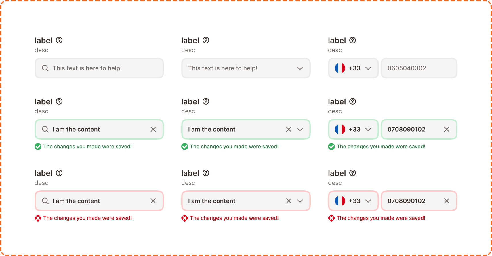
Structure
The parent input component is composed of four parts stacked vertically:
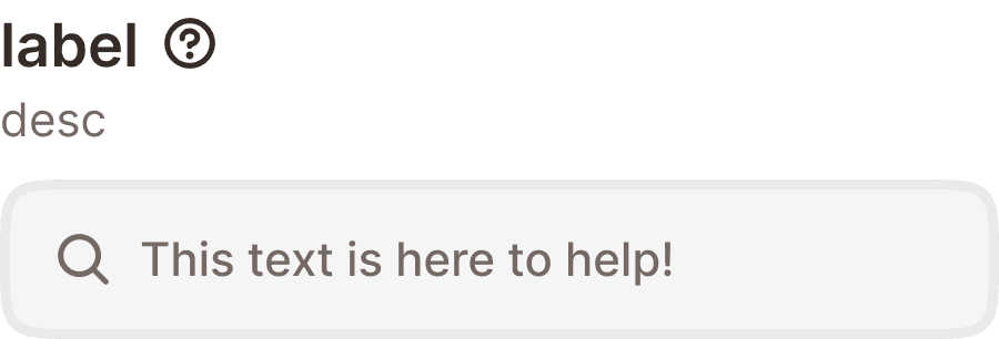
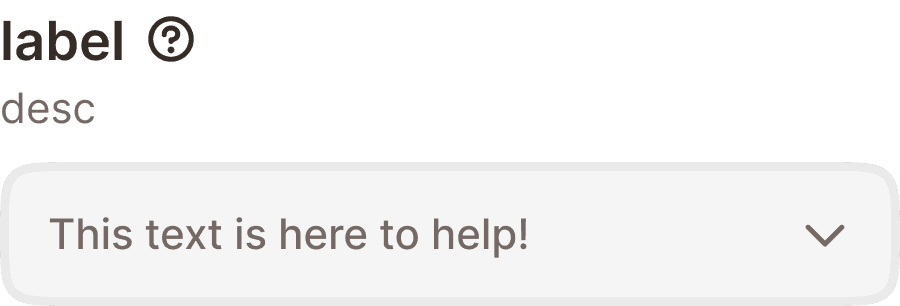
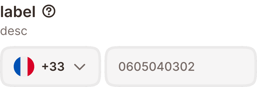
Label row
A bold label text paired with an optional help button ("?" icon). The label describes what data the field expects. The help button provides additional context via a tooltip (see Help Button component).
Description
An optional secondary line of smaller text below the label that provides guidance or constraints (e.g., "Must be at least 8 characters").
Field
The interactive area where the user enters data. This is a nested component that changes depending on the input type (see "Types" section below).
Feedback message
An optional message below the field that appears on validation. It uses a status icon and colored text to communicate success (green check + message) or error (red cross + message).
Types
The parent input supports three field types, each swapping the inner field component.
Text
The standard input type. Wraps any of the master input field variants (search, password, number, text only, text area). Used for most form contexts.
Dropdown menu
Replaces the inner field with a dropdown selector. Shows a chevron on the right and opens a menu of selectable options when tapped. Used when the user must choose from a predefined list.
Mobile number
A specialized field for phone number entry. Combines a country code selector (flag + dial code + chevron) on the left with a number field on the right. Used exclusively for phone number collection (onboarding, account settings).
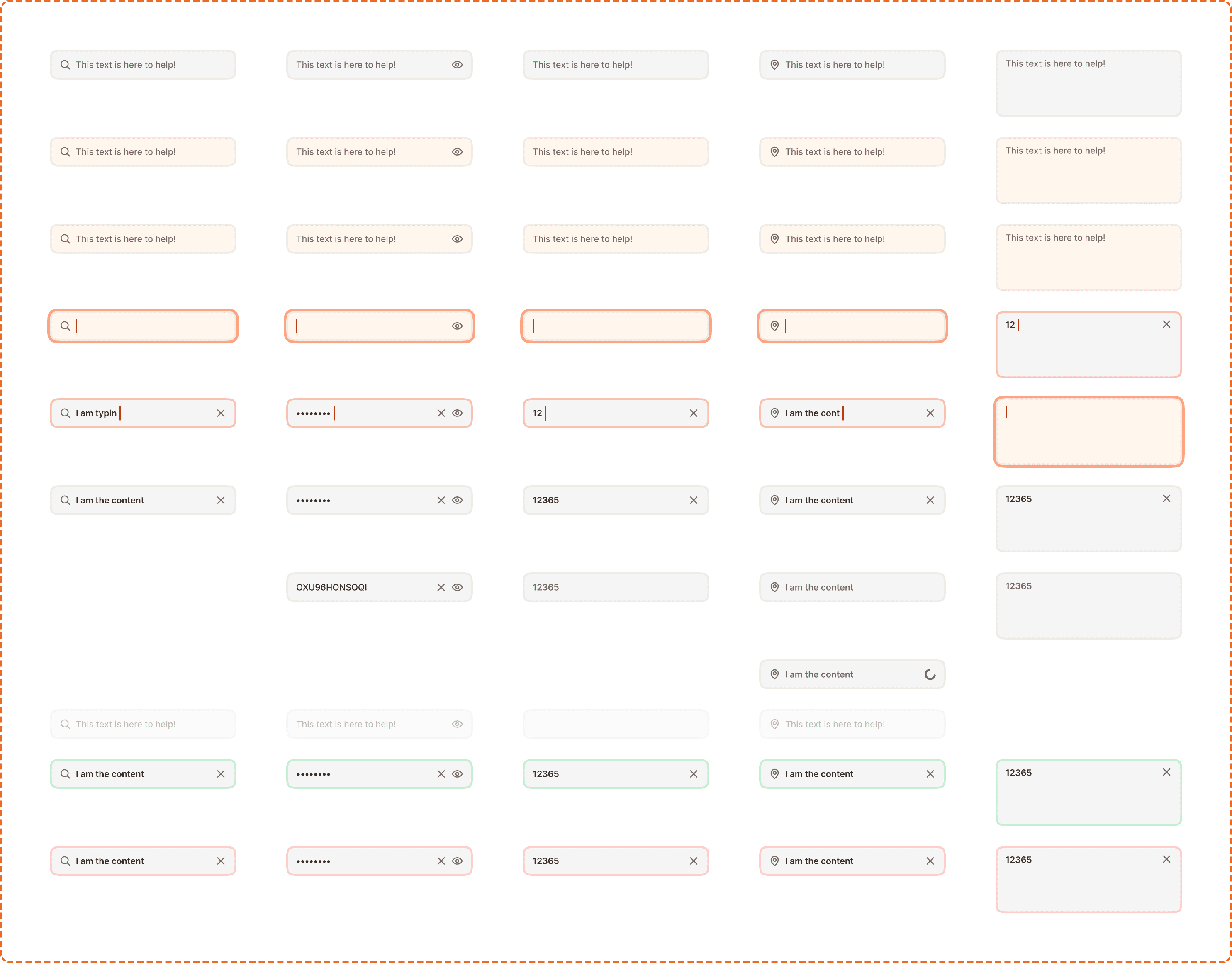
Master input field
The master input is the inner text field component used inside the text type. It supports 6 variants and up to 11 states.
Variants
Search includes a magnifying glass icon on the left and a clear (x) button on the right when filled. Used for searching exercises, workout history, and friends.
Password includes a visibility toggle (eye icon) on the right. Supports both hidden (dots) and visible states. Used for login and account creation.
Number is optimized for numeric entry. Triggers the numeric keyboard on mobile. Used for weight, reps, and other numerical data.
Text only is a plain text field with an optional leading icon. Used for names, notes, and general text entry. Also supports a loading state (spinner on the right) and a read only state.
Text area is a taller, multiline field for longer content. Used for workout notes, exercise descriptions, and any context where more than one line of text is expected.
States
All master input variants share these interaction states:
Default shows placeholder text in a muted color. The field is ready for interaction.
Hovered provides a subtle visual shift on desktop when the cursor is over the field.
Pressed gives immediate feedback during a tap or click before the field activates.
Focused highlights the field with the brand orange border, indicating the keyboard is active and the field is ready to receive input.
Typing shows the cursor active inside the field with the user's input appearing in real time.
Filled shows the completed value with a clear (x) button on the right for applicable variants. The field is no longer focused.
Filled hidden (password only) shows dots instead of the typed characters. The visibility toggle switches between hidden and visible.
Read only displays the value but does not allow editing. The field appears slightly muted and does not respond to interaction.
Disabled reduces the field to low opacity. No interaction is possible.
Loading (text only) shows a spinner on the right while data is being validated or fetched asynchronously.
Success highlights the field with a green border to confirm valid input.
Error highlights the field with a red/pink border and background tint to indicate invalid input.
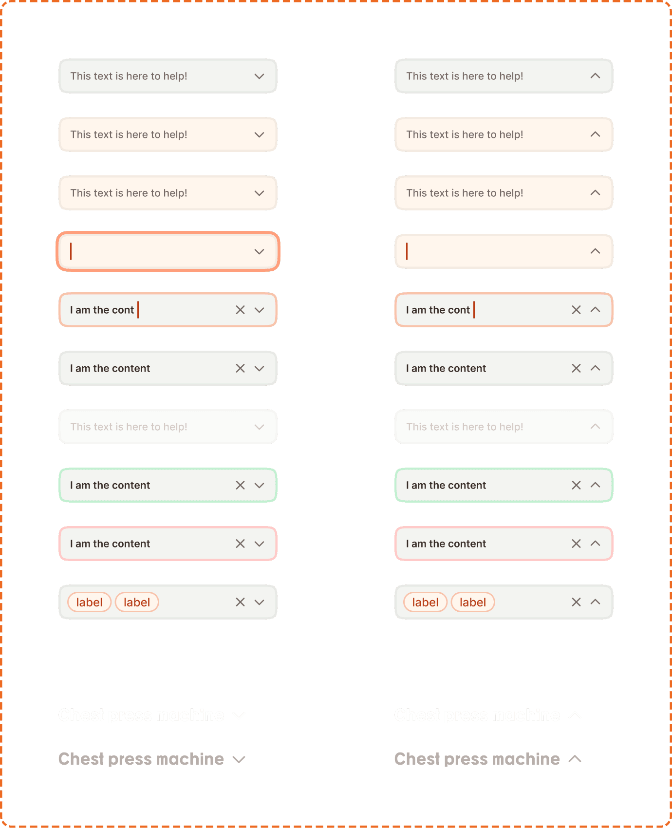
Master dropdown field
The master dropdown is the inner field component used inside the dropdown menu type. It supports 2 types, 2 modes, and up to 9 states.
Types
Default is the standard dropdown field: a filled grey container (broz-bg/neutral/middle/default) with a 3px border, 48px tall and up to 300px wide, with a chevron on the right. This is the type used in forms throughout the app, and the modes and states below describe it.
Strong is a borderless, heading style dropdown for use on dark or strong backgrounds. It drops the container fill and border entirely, shows the selected value in the heading font at 20px (text/heading/sm), and uses a larger 24px chevron. The text uses inverse content colors (white in default, dimmed broz-content/inverse/secondary when pressed), so it reads as a title rather than a form field. It is used as the exercise selector in the V2 workout topper. Strong supports only the default and pressed states (each with an open and closed mode), not the full state set below.

Modes
Closed (opened?=no) shows the field as a single row with placeholder or selected value and a chevron pointing down.
Open (opened?=yes) shows the field with the chevron pointing up, indicating the menu is visible below.
States
Default shows placeholder text and a down chevron. Ready for interaction.
Hovered provides a subtle visual shift on desktop.
Pressed gives immediate feedback during a tap.
Focused highlights the field with the brand orange border for keyboard navigation.
Typing allows the user to type and filter the options in the dropdown list.
Filled shows the selected value with a clear (x) button and chevron. Both clearing and reopening are possible from this state.
Disabled reduces the dropdown to low opacity. No interaction is possible.
Success highlights with a green border to confirm valid selection.
Error highlights with a red/pink border to indicate a required field is empty or invalid.
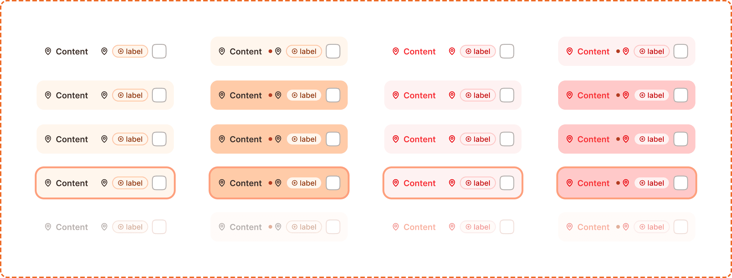
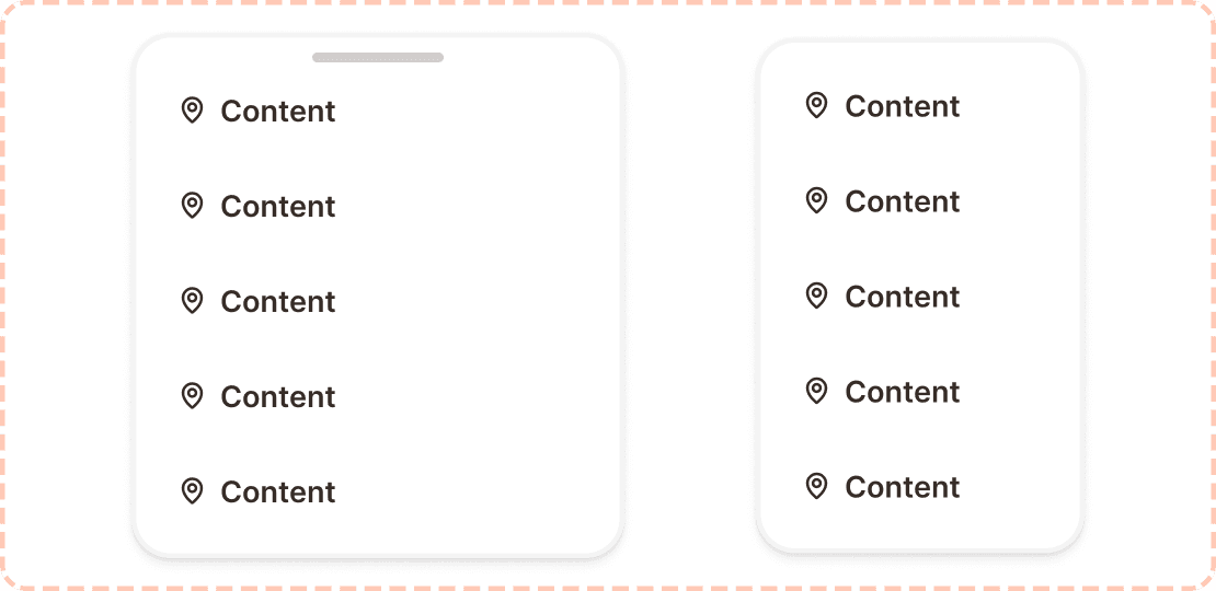
Menu and menu list item
When the dropdown is open, it reveals a floating menu panel containing a vertical stack of menu list items.
Menu list item
Each row in the dropdown menu. It shows an icon, a label, an optional secondary label/tag, and a checkbox. The item has the following properties:
active? indicates whether this item is currently selected (checkbox filled).
destructive? turns the item red for dangerous actions like "Delete" or "Remove". Used sparingly.
Menu list item states
Default is the resting state. The item is visible and ready for interaction.
Hovered provides a background tint on desktop when the cursor is over the row.
Pressed darkens the row to confirm a tap or click.
Focused shows a focus ring for keyboard navigation.
Disabled reduces opacity and prevents selection.
Interaction
Text fields
Tapping the field activates the focused state and opens the keyboard.
The appropriate keyboard type appears automatically (numeric for number fields, standard for text, email for email).
Tapping the clear (x) button empties the field and returns it to the focused state.
Tapping outside the field or pressing "Done" on the keyboard deactivates focus and triggers validation.
Dropdown fields
Tapping the dropdown opens the menu and switches the chevron direction.
The user can scroll through options or type to filter.
Tapping an option selects it, closes the menu, and fills the field.
Tapping the clear (x) button when filled resets the dropdown to empty.
Tapping outside the menu closes it without changing the selection.
Validation
Validation runs on blur (when the user leaves the field) or on form submission.
Success state shows a green border + green feedback message with a check icon below the field.
Error state shows a red border + red/pink background tint + red feedback message with an error icon below the field.
The feedback message appears below the field and pushes content down. It does not overlay other elements.
Placement
Inputs appear inside forms, settings screens, onboarding flows, and search headers. Always place them in a vertical stack with consistent spacing between fields.
Stack input fields vertically with consistent spacing between them. Never place two inputs side by side on mobile unless they are semantically paired (like first name / last name).
The label sits above the field, not beside it. This left aligned, top label pattern is the fastest to scan and works best on narrow mobile screens.
Search inputs can appear inline in headers or toolbars, where they take the full available width minus padding.
Accessibility
Touch target. All input fields are 48px tall, exceeding the 44px minimum. Dropdown menu list items are 64px tall.
Labels. Every input must have a visible label. Never rely on placeholder text alone to describe the field, because it disappears on focus.
Error messages. Error feedback must identify the field and describe the issue specifically. "This field is required" is better than "Error." Errors use both a red icon and red text, never color alone.
Focus indicator. The focused state uses the brand orange border, clearly visible against the white field background. This meets the 3:1 contrast ratio for non text elements.
Password visibility. The eye toggle lets users reveal their password before submitting, reducing errors from mistyped characters.
Content
Label copy should:
Describe what data the field expects in 1 to 3 words: "Email", "Password", "Exercise name", "Phone number".
Use sentence case.
Never end with a colon.
Placeholder copy should:
Give an example of valid input or a short instruction: "This text is here to help!", "Search exercises...", "0605040302".
Disappear when the user starts typing.
Never be the only way to communicate the field's purpose (always pair with a label).
Description copy should:
Provide constraints or guidance: "Must be at least 8 characters", "We'll send a verification code".
Be one sentence maximum.
Feedback copy should:
For success: confirm what was saved ("The changes you made were saved!").
For error: describe the problem and suggest a fix ("This email is already in use. Try logging in instead.").
Never use generic messages like "Error" or "Invalid input" without explanation.
Best practices
Always show the label. Even when space is tight, removing the label hurts usability and accessibility.
Use the right input type. Don't use a text field when a dropdown, number field, or search field would be more appropriate. The right type triggers the right keyboard and enables the right validation.
Validate on blur, not on every keystroke. Showing errors while the user is still typing is distracting and frustrating.
Keep the feedback message concise. One sentence explaining the issue and (for errors) one action to resolve it.
For password fields, default to hidden but always provide the visibility toggle.
For dropdowns with more than 8 options, enable the typing/filter mode so users can narrow the list quickly.
