Workout topper
The workout topper is a persistent header bar that sits at the top of the screen during an active workout session. It provides at a glance progress tracking, the current exercise context, and controls to close or collapse the workout view. In V2 it uses a dark, focused command bar that visually separates the active session from everything else in the app.
This component is visible throughout the entire duration of a workout. It answers two critical questions at a glance: "How far am I through the workout?" (the stepper) and "What exercise am I on?" (the exercise selector, shown as the bar's headline). It is the command center of the in workout experience.
When to use
Use a workout topper:
At the top of every active workout session screen, above the exercise table content.
Whenever the user is actively performing a workout and needs persistent progress and navigation controls.
Don't use a workout topper:
On the home screen, library, or any screen outside of an active workout session.
During workout template editing. The editing view has its own header pattern.
On post-workout summary screens. The workout is finished and the topper is no longer relevant.
Structure
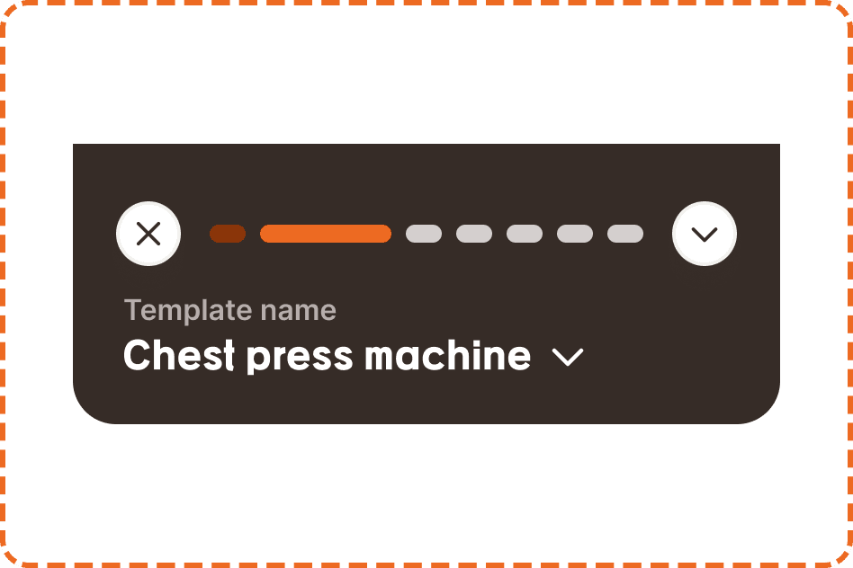
The workout topper is 393px wide (full screen width) and sits on a dark inverse background (broz-bg/inverse/strong/default). Content is left aligned and the bottom corners are rounded (radius/2xl). Its height follows its content, shorter than V1 now that the centered title and timer row are gone. It contains two stacked parts.
Top row
A horizontal row containing three elements:
Close button (x) on the far left, a white circular 36px button with a soft shadow. Tapping it triggers the discard modal ("You have some unsaved changes") if the workout has logged data, or closes the workout directly if nothing has been recorded yet.
Stepper in the center, spanning most of the available width. A horizontal row of small progress segments representing each exercise in the workout (see Stepper section below).
Collapse button (chevron down) on the far right, a matching white circular 36px button. Tapping it minimizes the workout topper to a compact view, giving more screen space to the exercise table below.
Workout header
A left aligned block below the top row containing:
Template name label a small muted line (broz-content/inverse/secondary) naming the workout the user is performing, for example "Template name". This is supporting context, not the focal point.
Exercise selector the current exercise name shown as the bar's headline in the heading font (e.g., "Chest press machine"), with a chevron. This is the visual focal point of V2: the hierarchy is flipped from V1, where the template name was the headline and the exercise sat in a smaller dropdown. Tapping the selector opens a list of all exercises in the workout, allowing the user to jump directly to a specific exercise.
Stepper
The stepper is a horizontal row of indicator-progressbar segments, one for each exercise in the workout. It provides a visual overview of how far through the session the user is.
The stepper spans the width between the close and collapse buttons, with each segment separated by a small gap. The number of segments matches the number of exercises in the active workout.
Indicator progressbar (atom)
Each segment is a small pill (10px tall, fully rounded) with 3 states:
Done (broz-icons/interactive/primary, deep burnt orange) indicates an exercise that has been fully completed (all sets logged and confirmed).
In progress (broz-icons/interactive/tiertary, bright orange) indicates the exercise the user is currently working on. This segment is wider than the others to draw the eye to where the user is.
Incoming (broz-bg/neutral/strong/default, neutral grey) indicates an exercise that has not been started yet.
The segments are arranged left to right in exercise order. As the user progresses through the workout, segments transition from incoming to in-progress to done, creating a visual "filling" effect.
Timer
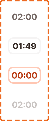
The timer is a compact rest countdown display that tells the user how long to rest between sets. It has 3 states:
Disabled shows the preset rest time (e.g., "02:00") in a neutral gray bordered container. The timer is not active. It is waiting for the user to complete a set, which triggers the countdown.
Ongoing shows the actively counting down time (e.g., "01:49") in a container with an orange tint background. The numbers update in real time every second.
Finished shows "00:00" in a container with a strong orange/red background, signaling that the rest period is over and the user should begin their next set. This state may trigger a haptic pulse or notification sound to alert the user.
Timer behavior
The timer starts automatically when the user marks a set as complete (tapping the checkmark in the exercise table). It counts down from the rest duration defined in the template for that set.
When the timer reaches 00:00, it transitions to the finished state and stays there until the user begins their next set or taps to dismiss.
Interaction
Close (x): Tapping it during an active workout triggers the discard modal if any data has been logged. If the workout is empty (no sets completed), it closes directly without a modal.
Collapse (chevron down): Minimizes the topper to a compact bar showing only the stepper, giving maximum vertical space to the exercise table. Tapping the chevron again (now pointing up) expands the topper back to its full height.
Exercise selector: Opens a list of all exercises in the workout. The current exercise is highlighted. Tapping a different exercise scrolls the content below to that exercise's table. This enables random access navigation without scrolling through the entire workout.
Timer: Tapping the timer when disabled does nothing (waiting for a set completion to trigger it). Tapping when ongoing pauses the countdown. Tapping when finished dismisses the finished state.
Placement
The workout topper is always pinned to the top of the screen during an active workout session. The exercise table content scrolls beneath it.
The topper replaces the standard app header and hides the tab bar. During a workout, the topper and the footer actions bar are the only persistent UI elements. Everything between them is scrollable exercise content.
The dark inverse background of the topper provides a strong visual distinction from the white content area below, reinforcing that this is a special, focused context.
Accessibility
Touch target. The close button, collapse button, and exercise selector all meet the 44px minimum touch target. The stepper segments are not interactive (they are status indicators only).
Screen reader. The stepper announces overall progress: "Exercise 2 of 6, Chest press machine." The exercise selector announces the current exercise name and that it is expandable. The timer, where present, announces its state: "Rest timer, 1 minute 49 seconds remaining" or "Rest timer, finished."
Contrast on dark. V2 places light text on the dark inverse background. The template name label uses broz-content/inverse/secondary and the exercise headline uses broz-content/inverse/primary, both verified against the inverse background for AA contrast.
Color independence. The stepper uses three visually distinct states: deep burnt orange (done), bright orange (in progress), and neutral grey (incoming). These are also distinguishable by position (left to right = past to future) and by the wider in-progress segment, so progress is communicated even without color perception.
Timer alerts. When the timer reaches 00:00, the finished state should trigger a haptic feedback pulse and optionally an audio chime. Users who are physically engaged (mid set, looking away from the screen) need non visual alerts.
Content
Template name label displays the template name exactly as the user created it. It should truncate with an ellipsis if it exceeds the available width. One line maximum.
Exercise selector shows the current exercise's common gym name ("Chest press machine", not "Inclined DB chest press variant B"). One line, truncated with ellipsis.
Timer shows the time in mm:ss format: "02:00", "01:49", "00:00". No hours. No milliseconds.
Best practices
The stepper segment count should match the exercise count exactly. If the workout has 4 exercises, the stepper shows 4 segments. If it has 8, it shows 8. The segments should scale their width to fill the available space, with the in-progress segment kept wider than the rest.
The workout topper should be the only persistent element at the top of the screen during a workout. Do not layer additional headers or navigation above it.
In V2 the exercise selector is the headline of the bar, not the template name. Keep the current exercise the most prominent text so the user always knows what they are on at a glance.
The collapse feature exists because some users prefer maximum screen space for the exercise table, especially when logging data rapidly. The collapsed state should still show the stepper so progress is always visible.
The dark inverse background is intentional. It visually separates the command center from the exercise data below, creating a clear cognitive boundary between "where am I" (topper) and "what am I doing" (exercise table).
