Preview
A preview is a detail view that expands a program or template card into a full summary with its contents and a contextual action menu. It shows the user everything they need to know about a workout entity before they decide to start, edit, duplicate, or delete it.
In Muba, previews appear when a user taps on a program or template in their library. They serve as the decision point between browsing and acting. The user sees the full description, the contained workouts or exercises, and the available actions, all without navigating to a separate screen. This keeps the experience fast and contextual.
When to use
Use a preview:
When the user taps a program or template card in the library to see its full details before taking action.
As an intermediate detail view that lets the user decide between starting, editing, duplicating, or deleting.
Anywhere a summary of a workout entity needs to be shown alongside its contextual actions.
Don't use a preview:
For browsing lists of programs or templates. Use the workout card component for list items.
During an active workout session. Use the exercise table component instead.
For quick actions that do not need a detail view. Use a long press context menu or the action button popover.
Types
The preview has 2 types controlled by the type property.
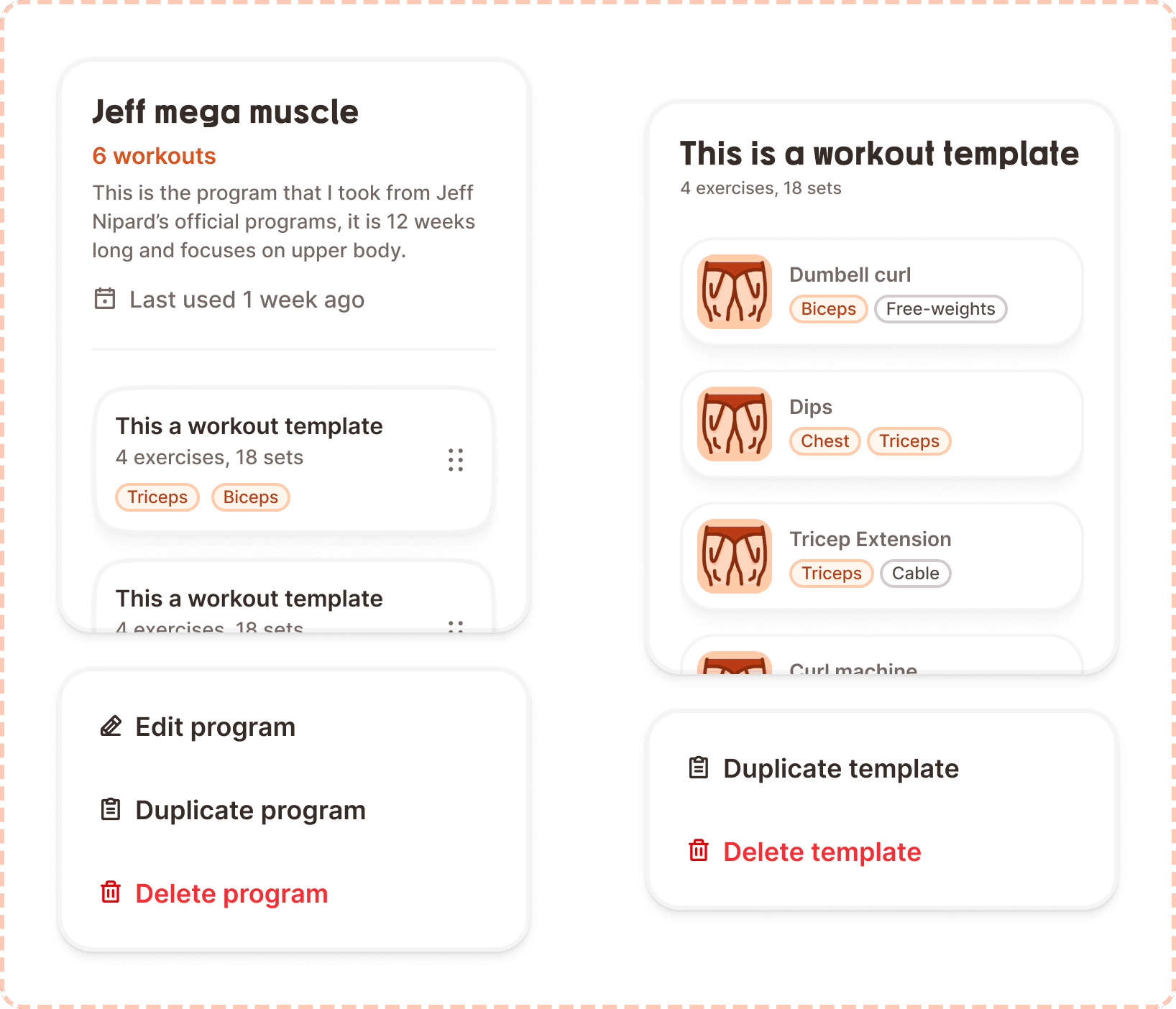
Program
Shows a full program summary: program name, workout count, description, last used date, and a scrollable list of its contained workout templates (using the workout card component in the inside-program variant). The context menu offers Edit program, Duplicate program, and Delete program.
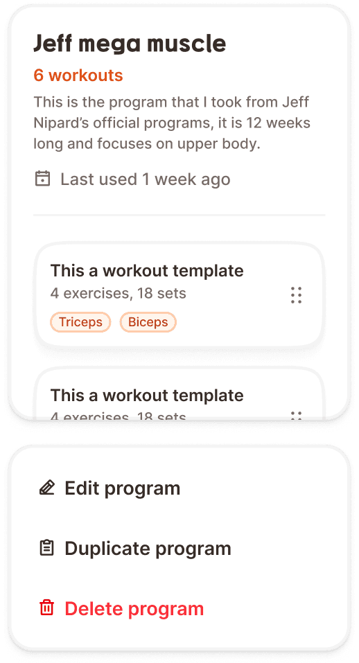
Template
Shows a full template summary: template name, exercise and set count, and a scrollable list of its contained exercises (each showing the exercise thumbnail, name, and muscle/equipment badges). The context menu offers Duplicate template and Delete template.
Structure
The preview is composed of two stacked sections separated by a 24px gap.
Preview card
A large white card (329px wide, 400px tall) with 20px border radius (radius/xl), 3px border (broz-borders/subtler), 24px internal padding (padding/2xl), medium shadow (shadow/md), and overflow: clip to handle content that exceeds the card height.
Header area contains the entity details, separated from the content below by a 2px bottom border:
For program type:
Program name in Mubax Bold 20px/28px (
text/heading/sm)Workout count in brand orange ("6 workouts") in Inter SemiBold 16px (
text/content/body/emphasis,broz-content/interactive/secondary#df5117)Description in Inter Medium 14px (
text/content/note/accent,broz-content/neutral/tertiary#756965)"Last used" date row with a calendar icon (18px) and date text in Inter Medium 16px (
text/content/body/accent)
For template type:
Template name in Mubax Bold 20px/28px (
text/heading/sm)Stats ("4 exercises, 18 sets") in Inter Medium 14px
Content area below the header border, with a 24px gap from the header:
For program type: A vertical list of workout card instances (template type, inside-program variant) with drag handles, showing each template's name, stats, and muscle badges. The list is scrollable within the 400px card height.
For template type: A vertical list of exercise rows, each showing the exercise thumbnail image, exercise name, and muscle/equipment badges. The list is scrollable within the card.
Context menu
A floating action menu card with 24px border radius (radius/2xl), 3px border (broz-borders/subtler), 12px internal padding (padding/lg), medium shadow (shadow/md), and a minimum width of 200px.
Each action item is a row with an 18px icon, 8px gap, and a label in Inter SemiBold 18px (text/content/highlight/emphasis). Items have 16px padding (padding/xl) and 16px border radius (radius/lg).
For program type, three actions:
Edit program with pencil icon (neutral text color)
Duplicate program with clipboard icon (neutral text color)
Delete program with trash icon (danger red text,
broz-content/danger/tertiary#fb2c36)
For template type, two actions:
Duplicate template with clipboard icon (neutral text color)
Delete template with trash icon (danger red text)
The destructive action always sits at the bottom of the menu, visually separated by its red color.
Interaction
The preview appears when the user taps a program or template card in the library. It can appear as a bottom sheet, a centered overlay, or an inline expansion depending on the implementation context.
Tapping a context menu action triggers the corresponding flow:
Edit navigates to the editing view for that program or template.
Duplicate creates a copy and navigates to the new copy for editing.
Delete triggers the delete modal (see Modal component) for confirmation before proceeding.
The content list inside the preview card is scrollable if it overflows the 400px card height. The header area remains fixed at the top while the list scrolls.
Tapping outside the preview (or swiping it down if presented as a bottom sheet) dismisses it.
Placement
The preview appears as an overlay or bottom sheet above the library screen. It does not replace the library. The user can dismiss it and return to browsing without any state change.
The preview card and context menu stack vertically with a 24px gap between them, centered or bottom aligned depending on the presentation mode.
On mobile, a bottom sheet presentation is recommended: the preview slides up from the bottom, and the user can swipe down to dismiss.
Accessibility
Touch target. Context menu action items have 16px padding on all sides, providing generous touch areas that exceed the 44px minimum when combined with the 18px icon and 26px line height.
Screen reader. The preview card announces the entity type, name, and key stats: "Program: Jeff mega muscle, 6 workouts, last used 1 week ago." Context menu items announce their labels: "Edit program, button", "Delete program, destructive, button."
Keyboard. When presented as an overlay, focus is trapped inside the preview. Tab cycles between the content list and context menu actions. Escape dismisses the preview.
Color independence. The destructive "Delete" action uses both red text and a distinct trash icon. All other actions use neutral text with unique icons (pencil for edit, clipboard for duplicate).
Content
Program header should show the program name (user created, can be any length, truncated with ellipsis after 2 lines), the workout count in orange ("6 workouts"), a description (user written, multi line, truncated by card overflow), and the "Last used" date.
Template header should show the template name and a stats line with exercise count and total set count ("4 exercises, 18 sets").
Context menu labels should start with a verb and name the entity type: "Edit program", "Duplicate template", "Delete program". This removes ambiguity about what the action affects.
Date formatting for "Last used" should use relative time: "1 week ago", "3 days ago", "Today", "Yesterday". Avoid absolute dates in the preview since relative time is faster to process.
Best practices
The preview is a read only summary. Editing happens after tapping "Edit program" or "Edit template", not inside the preview itself.
The 400px card height is fixed. Content that overflows scrolls within the card. This prevents the preview from growing unbounded on screens with many templates or exercises.
The "Delete" action should always trigger the delete modal (see Modal component). Never delete directly from the context menu without confirmation.
The workout count in orange ("6 workouts") uses the brand interactive secondary color (
broz-content/interactive/secondary#df5117) to draw attention to the most important stat. This is one of the few places where orange is used for informational text rather than interactive elements.The nested workout cards inside the program preview use the inside-program variant (compact, 60px height) to maximize the number of visible templates within the 400px card.
