Streak
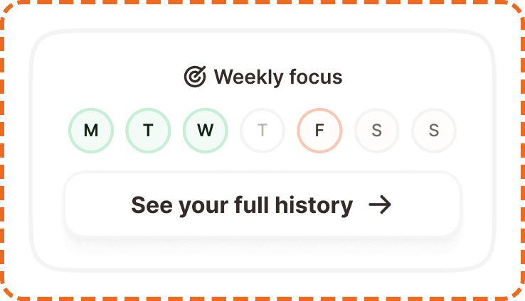
A streak displays the user's weekly workout activity as a horizontal row of day indicators (Mon through Sun), showing at a glance which days they trained, which they missed, and which are still upcoming. It is wrapped in a card that includes a link to the full history.
Streaks are a core motivation mechanic in Muba. They tap into the psychology of consistency: seeing a row of completed days makes users want to keep the chain going. The component is designed to be instantly readable without any interaction, providing a quick visual summary the moment the user opens the app.
When to use
Use a streak:
On the workout screen to show the current week's training activity at a glance.
Inside a profile or stats section to visualize weekly consistency.
Wherever you need to communicate training frequency for the current week.
Don't use a minimized workout:
For long term progress over months or years. Use a chart or calendar view instead.
For goal tracking that is not tied to days of the week. Use a progress bar instead.
For displaying a single day's activity. The streak only makes sense as a full week.
Structure
The streak is built in three layers: the day indicator atom, the week row, and the wrapper card.
Streak day (atom)
Each day is a vertical stack of a 24x24px status icon and a day label below it. The icon and label are separated by 4px. The day label uses Inter at 12px/16px (text/content/caption).
The day indicator has three states:
Default shows a gray circle icon with the day label in muted text (Inter Medium, broz-content/neutral/tertiary, #756965). This represents a day that has not occurred yet or has no data.
Active shows an orange circle with a white checkmark icon. The day label switches to bold text (Inter SemiBold, broz-content/neutral/primary, #090808). This represents a day where the user completed a workout.
Missed shows a small orange X icon with the day label in muted text. This represents a day that passed without a workout being logged.

Streak wrapper (card)
The full card component. It contains the streak row and a secondary button below it, all inside a rounded card container.
Container: White background (broz-bg/neutral/light/default), 3px solid border (broz-borders/subtler, rgba(30,27,26,0.05)), 16px border radius, 24px top padding, 16px bottom padding, 16px horizontal padding, 12px gap between the streak row and the button.
Button: A full width secondary button (white fill, neutral border, 48px height, 16px radius) with the label "See your full history" and a right arrow icon. It uses Inter Bold at 16px (text/content/body/strong).
Interaction
The day indicators are non interactive. They are status displays, not inputs. Users cannot tap individual days to mark them as complete or missed. The streak updates automatically when a workout is logged.
The only interactive element is the "See your full history" button, which navigates to a detailed history view. This button follows standard button interaction states (default, hovered, pressed, focused, disabled).
Placement
On the home screen, the streak card sits near the top of the content area. It should be one of the first things visible when the user opens the app, reinforcing their training consistency before they take any action.
Place the streak card prominently in the upper portion of the home screen.
Don't bury it below the fold or inside a secondary tab. Its motivational value depends on being seen immediately.
Always display the full week (Mon through Sun), even if some days are still upcoming. Showing upcoming days as default (gray) sets the expectation and creates a visual goal.
Accessibility
Color independence. The active state uses both an orange check icon and bold text. The missed state uses an X icon. The default state uses a gray circle. All three states are distinguishable through icon shape alone, not just color.
Screen reader. Each day should be announced with its name and status: "Monday: completed", "Tuesday: completed", "Thursday: missed", "Sunday: upcoming." The button should announce "See your full history."
Dynamic sizing. Day labels scale with system font size. The circles and icons grow proportionally to maintain alignment. The card height adapts accordingly.
Content
Day labels use three letter abbreviations: Mon, Tue, Wed, Thu, Fri, Sat, Sun.
The history link label should be "See your full history" with a right arrow icon. This is action oriented and specific. Avoid generic labels like "History" or "View more."
Best practices
Always show the full seven day week. Hiding upcoming days would remove the visual "goal" of filling the row and reduce the motivational effect.
The streak updates automatically when a workout is saved. Never require the user to manually mark a day as complete.
The missed state should only appear for past days where no workout was logged. It should not appear for the current day (which should still show as default/upcoming) or future days.
Consider adding a subtle animation when a day transitions from default to active (e.g., the checkmark scales in) to create a small moment of reward when the user finishes a workout.
The streak card uses a very subtle border (5% opacity) to separate it from the background. This is intentional. The card should feel lightweight, not heavy or boxed in.
