Finishing card
A finishing card is a summary stat card displayed on the post workout screen after a session is completed. It presents a single key metric or achievement in a compact, visually distinct card. Multiple finishing cards are arranged in a grid to give the user a quick overview of their performance.
Finishing cards are the reward moment of the Muba experience. After the effort of a workout, the user sees their results presented as clear, celebratory snapshots: total duration, volume lifted, personal records broken. These cards turn raw data into moments of accomplishment.
When to use
Use a finishing card:
On the post workout summary screen to display key session metrics (duration, total volume, sets completed, exercises performed).
To highlight achievements and personal records set during the session.
Anywhere a single stat needs to be presented as a standalone, glanceable card.
Don't use a minimized workout:
For long term progress over months or years. Use a chart or calendar view instead.
For goal tracking that is not tied to days of the week. Use a progress bar instead.
For displaying a single day's activity. The streak only makes sense as a full week.
Types
The finishing card has 2 types controlled by the type property.
Numbers
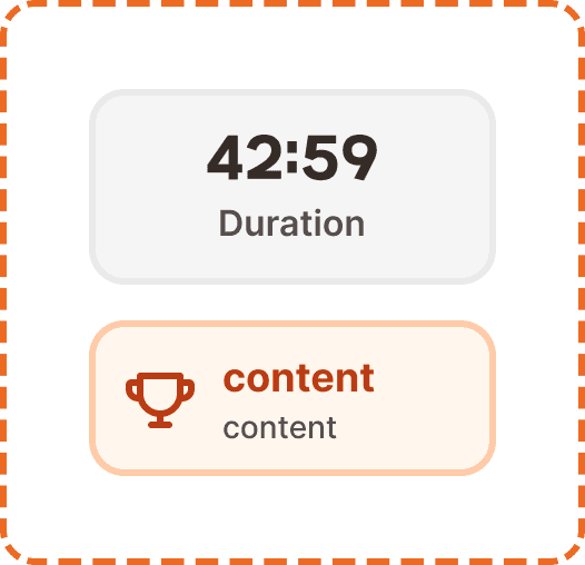
A neutral stat card for displaying a single numeric metric. Shows a large value and a label describing what the value represents.
Container: Neutral gray background (broz-bg/neutral/middle/default, #f6f5f5), 2px border (broz-borders/subtler, 5% opacity), 16px border radius (radius/lg), 16px padding (padding/xl), 183px wide.
Value is displayed in Mubax Bold 24px/32px (text/heading/md, broz-content/neutral/primary #090808). Center aligned. This is the headline number the user should see first.
Label sits below the value in Inter SemiBold 16px/24px (text/content/body/emphasis, broz-content/neutral/secondary #544d4b). Center aligned. Describes what the value represents.
Examples: "42:59" / "Duration", "12,450 kg" / "Total volume", "24" / "Sets completed", "6" / "Exercises".

Records
A branded achievement card for highlighting personal records or milestones set during the session. Uses the brand peach and orange palette to create a celebratory, visually elevated moment.
Container: Brand peach background (broz-bg/interactive/middle/default, #fff6ed), 3px orange border (broz-borders/interactive/middle/default, #ffcba8), 16px border radius (radius/lg), 16px horizontal padding (padding/xl), 12px vertical padding (padding/lg), 183px wide.
Icon (left side) is a 32px trophy or achievement icon in the brand orange color. It provides an instant visual signal that this card represents something special.
Title (right of icon) in Inter Bold 18px/26px (text/content/highlight/strong, broz-content/interactive/primary #8a3408). Shows the record name or achievement.
Subtitle below the title in Inter Medium 14px/20px (text/content/note/accent, broz-content/neutral/secondary #544d4b). Provides context about the record.
Examples: trophy icon + "New PR!" / "Bench Press 90kg", trophy icon + "Volume record" / "Chest day highest ever".

Interaction
Finishing cards are non interactive by default. They are display only elements on the summary screen.
If a records card represents a tappable achievement (e.g., tapping "New PR!" opens the exercise detail with the historical chart), the card should show a pressed state (slight darkening) on tap and navigate to the relevant detail view.
Placement
On the home screen, the streak card sits near the top of the content area. It should be one of the first things visible when the user opens the app, reinforcing their training consistency before they take any action.
Place the streak card prominently in the upper portion of the home screen.
Don't bury it below the fold or inside a secondary tab. Its motivational value depends on being seen immediately.
Always display the full week (Mon through Sun), even if some days are still upcoming. Showing upcoming days as default (gray) sets the expectation and creates a visual goal.
Accessibility
Color independence. Numbers cards use a neutral gray that is visually distinct from the records cards' peach background. The records cards also include an icon and a thicker orange border for additional non color differentiation.
Dynamic sizing. Both card types adapt their height to accommodate larger system font sizes. The width remains fixed at 183px.
Content
Numbers card values should be formatted appropriately for their metric: time in mm:ss format ("42:59"), weight with unit ("12,450 kg"), counts as integers ("24", "6").
Numbers card labels should be a single word or short phrase: "Duration", "Total volume", "Sets completed", "Exercises". Sentence case, no period.
Records card titles should be celebratory and specific: "New PR!", "Volume record", "Longest session". Short, punchy, motivating.
Records card subtitles should provide the concrete detail: "Bench Press 90kg", "Chest day highest ever", "1h 23min". One line, factual.
Best practices
Show a minimum of 2 numbers cards on every post workout screen (duration and total volume are always available). Additional cards (sets completed, exercises) appear if the data is relevant.
Records cards only appear when the user actually set a new record or achieved something notable during the session. Do not show them if there is nothing to celebrate. An empty records section is better than a fake achievement.
The records card uses the same brand peach background and orange border as the empty state component. This is intentional: both represent a "special moment" in the interface. The empty state says "fill me", and the records card says "you did it."
Keep the grid to a maximum of 6 cards on the summary screen. More than 6 becomes overwhelming. If there are many records, show the top 3 and offer a "See all records" link.
The Mubax heading font on the numbers card value creates a strong visual anchor. The large, bold number should be the first thing the user's eye lands on when scanning the summary screen.
